Hi scrappers! This is my first post on Tracy’s team so I hope you enjoy it and hopefully learn something new!
Today I’m going to tell you more about color, specifically monochromatic layouts. A monochromatic layout is one that uses a main color with its various hues.
Some might say that a monochromatic layout is boring, but you can get some stunning results with this technique.
It can really make your pictures pop on your page and give emphasis to your photos without distracting from them with many colored elements. It can also draw attention to one or two key details.
Using different hues of the same color on the page can also emphasize different themes or emotions: yellow for happiness or a summery, warm feel; red for love and a romantic layout; blue for a peaceful, serene layout…the list is endless.
Our designers often make it easy for us by creating kits that have more than one paper and element in similar colors so we can just pick those and be good (thanks, designers), but do not be afraid to mix and match from more than one kit to get the effect you are looking for!
This week I would like to challenge you to mix things up a bit from your usual designs…try a monochromatic layout! Here are a few tips to keep in mind:
1. You can use several hues of the color to create contrast (different textures of the SAME hue also works)
2. You can break up the color by using neutrals such as black/white/tan
3. It is OKAY to add a different color (but maybe just a little to draw emphasis or to break it up a bit)
4. If your photos are detracting from your monochromatic look as they are too busy/bright, change them to black and white or another hue. This is also true for elements that you love, but are the wrong color: recolor them!
Here are some examples to inspire you, with the kits used to create them:
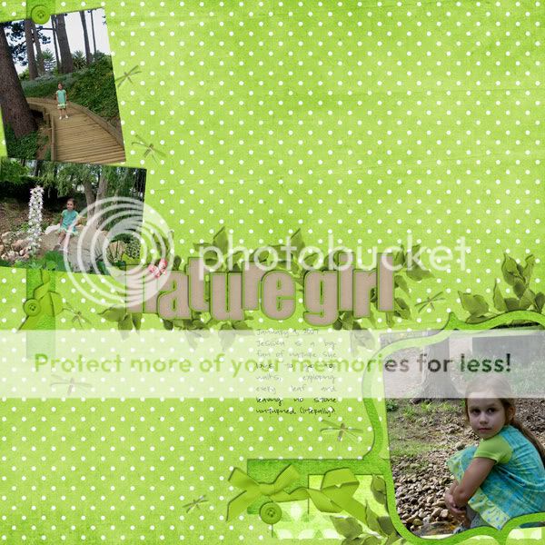
I wanted lots of green here to emphasize my daughter’s love of nature. It just so happens that she was conveniently wearing a green dress that day to help with my mission! I used the neutral alpha to break up the green just a bit and added the pink butterfly for a LITTLE color (I have to admit it was hard to not keep adding more and more pink, but I really wanted to stick with the green theme). All supplies were from Nature Girl and I used a template from Cool Clusters vol 1.
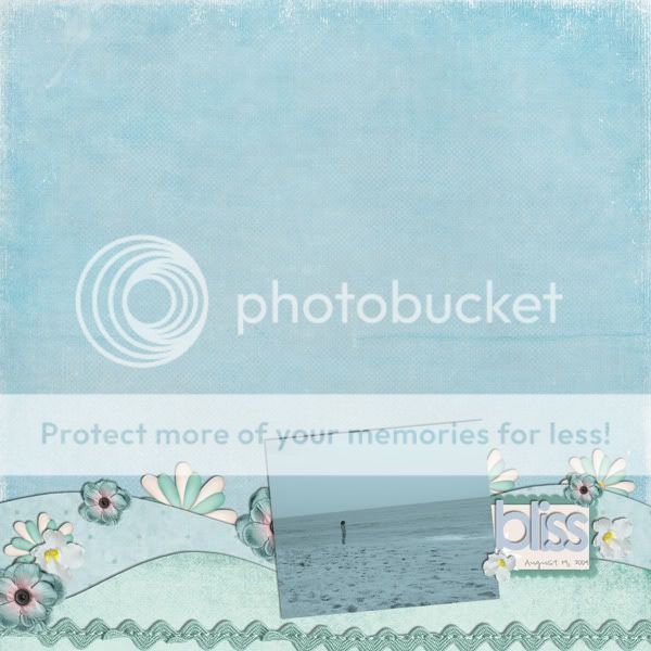
Here is a blue layout I did of my daughter staring out at the ocean. I wanted it to be peaceful so I recolored the picture (her bathing suit was bright pink) and also recolored the alpha slightly to match. I used multiple kits to get the effect I wanted: Star Struck Vol 2: Beth, Aloha Dreams, Fab Fifties, Spring Days Mini kit and My Ribbon Rack – Spring.
My fellow CT Stars have shown me a rainbow of layouts that you will love too. Here they are:

In this beautiful warm layout by Carrin, you can see and feel the brown chocolate! It is very comforting! She recolored her picture to match and enhance the overall warm feel here. Carrin used A Rainbow Promise collab with Ellie Lash, Carly, Foam-abet, Crackled Characters – White, First Feast, Early Birds collab with Brandy Designs, Family Ties and Snow Day (recolored).
From warm, to cool, here are two snowy day layouts from Lindsey:

By eliminating the color in these photos, Lindsey has created a very icy feel in these stunning layouts. The silvers, greens and blues make it feel like a very cold day. Lindsey used Icy Days.
Amy’s layout below just makes me smile: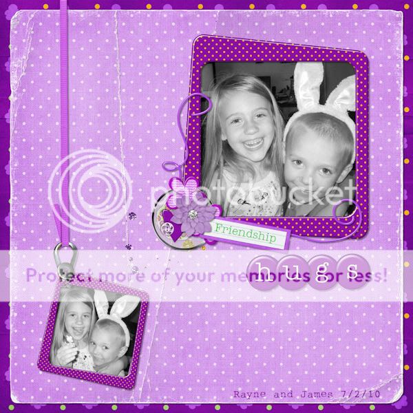
The focus is truly on the photos here and the happy purple color makes us all want to laugh with these cute kids! Amy used the fun kit, Friends are Like Flowers, a collab with Connie Prince.
Here is another beautiful layout from Carrin:
The blues here are so peaceful. I feel totally relaxed just looking at it, as though I was in another place (one without any stress)!
Carrin used the 8/10/10 Tuesday Template at scrapmatters, Oceanside (some parts recolored), Cops and Robbers – a collab with Melissa Bennett (alpha recolored), 7-up journalers and Stamped, Dated & Stated
Now for a more “romantic” layout. Well, at least, that’s how I think of it:
Theresa used the black here to break up the red/pinks. See that dramatic title? Fabulous work! Theresa used Nature Girl (pink papers), Foam-abet Basic Black Alpha, Defining Me (black paper, stamp frame), My Ribbon Pack: Spring (recolored) and Girls Day Out (chandelier, damask ribbon)
Here’s another red layout from Bree:
Bree’s use of white space here draws our eyes to her fabulous photo and that red cluster in the corner balances it all out perfectly. Bree used Star Struck Templates vol. 2 – Beth, Hearts Abound, Just The Basic’s: White paper pack, Lovely Days mini, Family Ties, Indian Summer, My Ribbon Rack: Christmas Traditional and Stamped, Dated & Stated vol. 1
So with all that inspiration, you can do it! Grab some pictures, pick a color and have fun creating those monochromatic layouts!
