Hello everyone! Candy here with another Tips, Trends, and Techniques Tuesday post.
I started digi-scrapping in August of 2007 and after several months of experimenting and cruising galleries for inspiration I noticed that I was mostly drawn to layouts that were clean, simple and organized. I especially love layouts that feature blocks of paper or pictures all lined up neatly in a row.
The trouble that I had was that I found it super difficult to get everything lined up just so! Often I would spend hours on a layout, painstakingly lining up blocks of paper or pictures or even elements only to print and realize that one thing wasn’t quite lined up.
I struggled and struggled until I discovered my favorite tools – the alignment buttons in Photoshop.
In Photoshop (I am using CS5, but all versions will look similar) and Photoshop Elements, select your Move tool and this menu will appear at the top of your screen.
See all of those little boxes with lines? Those are your alignment tools.
To show you what I mean, I took this little button from Trixie’s kit Every Day With You and duplicated it a couple of times. This is exactly how it might appear in a layout of mine.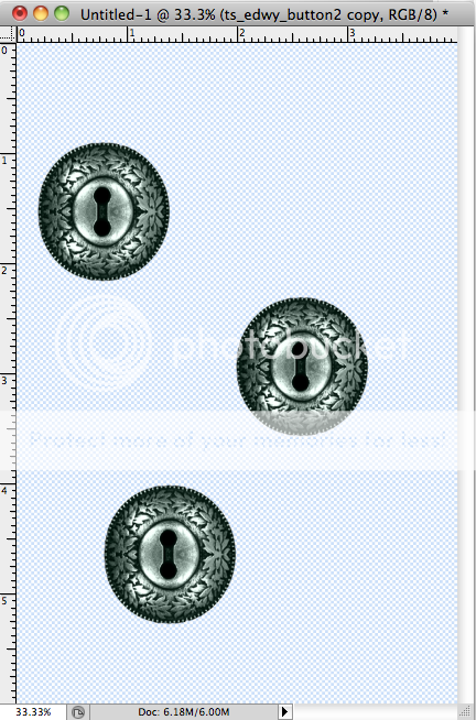
That sure is messy looking! Let’s line them up.
The first thing you’ll want to do is select the items that you want to line up in your layers menu. To do this hold Command (Cntl on a PC) and click on your layers until they are all selected. My buttons page looked like this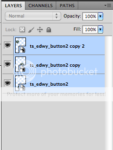
on a layout you will have other layers that are not selected. Remember to only select the items that you want to align.
After all my layers were selected I clicked Align Horizontal Centers (you can see the button names by hovering over the pictures with your mouse in Photoshop)
and like magic, the buttons all line up.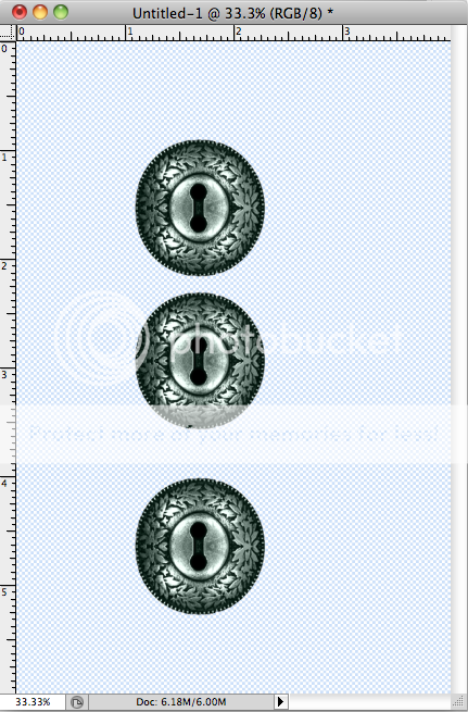
It’s still not perfect though. Did you notice that the pesky middle button is too close to the top button? We can fix that, too!
Click Distribute Vertical Centers
and the middle button is now perfectly even between the top and bottom buttons!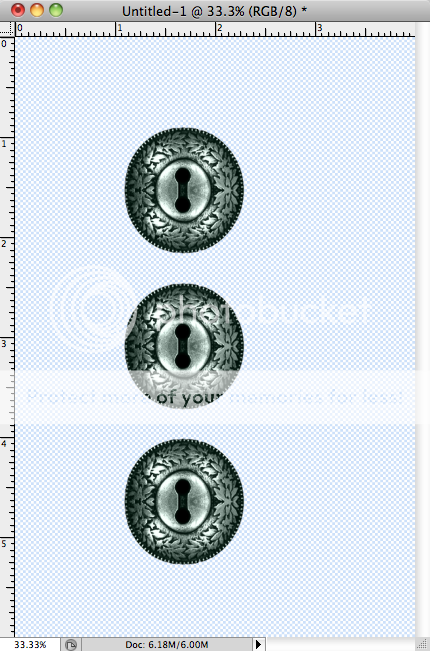
You can do the same thing for a horizontal line of pictures or elements by using the Align Vertical Centers button
And then the Distribute Horizontal Centers button.

Experiment with all of the other alignment options as well to see what you like best!
Here’s a layout I did using these tools and Saffron Blues by Trixie Scraps Designs and Bella Gypsy: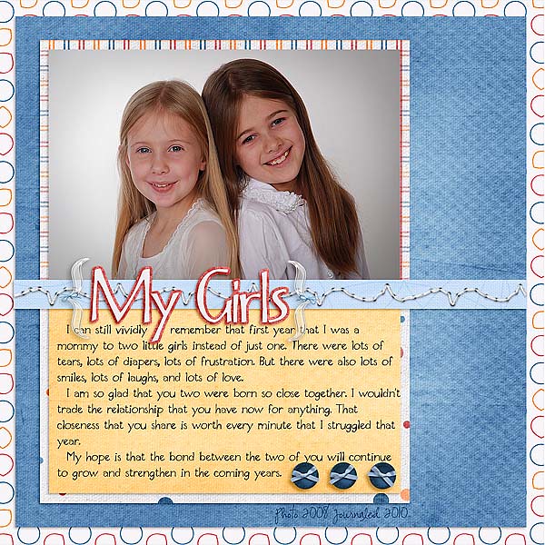
See the perfectly aligned and distributed buttons? 
And here’s some more examples –
From Tracy, using A Boo-tiful Night. Love those lined up photos!:
By Candy, using Every Day With You, and lining up the buttons along the right side:

Here’s one from Bethie using aligned circles from the kit Sparkle of Love:

I hope this little trick will help you when you want to get things all lined up in your layouts! We’d love to see what you create, so be sure to submit your layouts for the Super Saturday Show-offs!

