When I first started learning to digiscrap, one of the most frustrating problems I had was in resizing elements and papers and having them maintain the correct proportions. I spent more time than I care to think about trying to adjust each side of the element or paper to the exact right proportion and sometimes things would still wind up looking funny. It wasn’t until I was a couple of months into learning Photoshop and who knows how many “interestingly” proportioned elements that I learned how to fix this little faux pas.
Because I hope I am not the only one out there that struggled with this technique, I want to share a couple of tricks.
I am using Photoshop CS5, so my tools may be in a different place than in your program, but most programs have tools available to help you maintain correct proportions.
First, I am going to open up a new palette and place a glitter swirl from Distinct Hush – a collab by Trixie Scraps Designs and Studio Rosey Posey.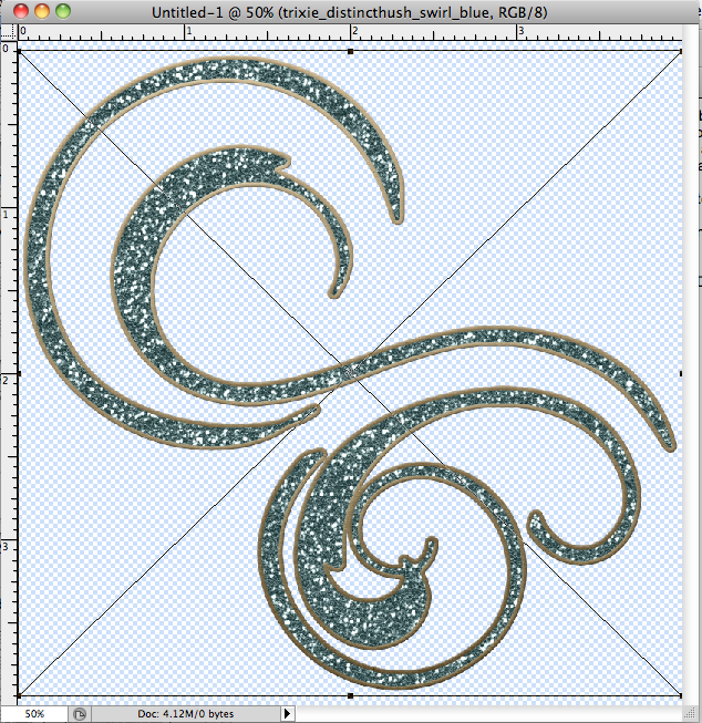
You’ll notice the black lines around the element and the X across. Those are the guidelines that let me know this element is ready to be re-sized. To make these lines appear I can either use the “Edit – Free Transform” menu option, or the keyboard shortcut Cmd+T (Mac) or Ctrl+T (PC).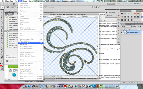
Now, I am going to grab the top right corner of the guidelines – you’ll know you have it when your pointer changes to a dual-tip arrow – and re-size my element without paying attention to the proportions.
The element now looks squished from the top and not so much like the original. 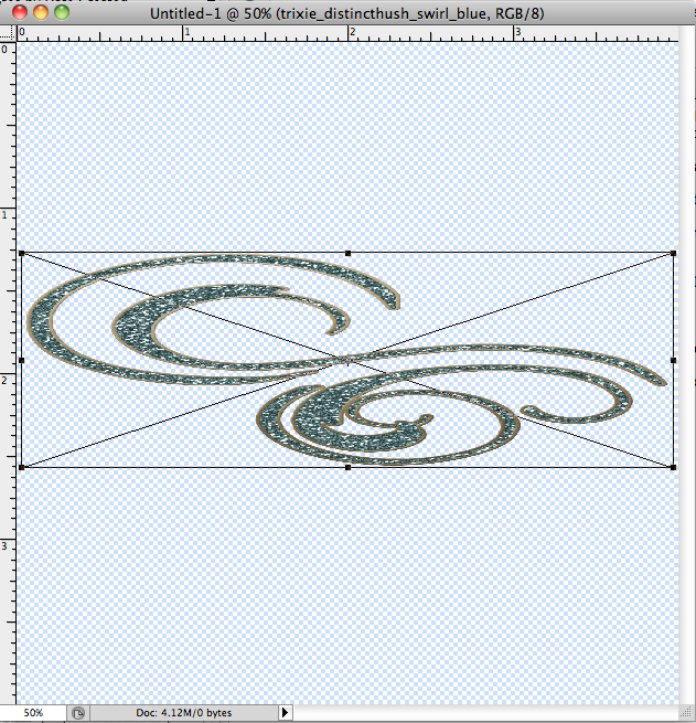
What I used to do was try to eyeball getting the element back to the right shape going back and forth trying to adjust the width and height just by looking at it. There’s an easier way to fix this!
See the little boxes at the top of my screen? They’ll only appear when you are “transforming” an element or paper (Free Transform in the Edit menu or Cmd+T/Ctrl+T). 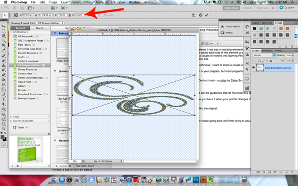
Here’s a close-up:
The “X” and “Y” numbers are for setting reference points. We’re going to ignore these. We want to focus on the second set of boxes, labelled “W” and “H” for Width and Height. The boxes are filled with percentages that indicate the size of the element being transformed. You’ll notice that the numbers in the picture don’t match, indicating that the element is much wider than it is tall.
To make the element proportional again, we need to make these numbers match. The easiest way to do this is to click on the chain symbol between the two boxes. This locks the the ratios together and keeps your element in perfect proportion as you resize it. 
And here is my element, resized, with accurate proportions. 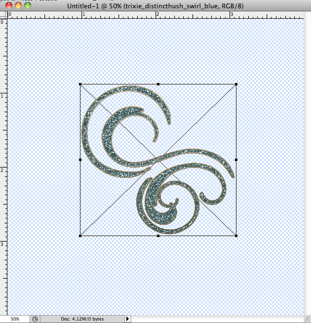
If you click the chain symbol before you make any changes you can easily resize your elements and papers without ever losing their proportions to begin with!
Now that you understand the basics of maintaining proportions let’s talk about shortcuts!
The equivalent of clicking the chain symbol to lock your ratios is holding down the “Shift” key while you resize your element. Just be careful to release the mouse before you release the shift key or the ratios will revert to what they would have been without being locked.
For an advanced method you can use “Alt+Shift” while you drag on any corner to resize from the center. This is a great technique for when you have an element where you want it, but might want to tweak the size a bit. The center stays in place as if it is glued down and the element changes size, shrinking or expanding – without moving across the page.
It was amazing how much time I saved after learning to use this handy little tool and shortcuts when working on my layouts!

All Trixie Scraps Designs products can be found in the following online stores: Trixie Scraps Shop * Scrap Matters * Gotta Pixel * Scrapbook Bytes * Funky Playground


GREAT tip!!!! Thank you!!!