Hi all! Carolyn here to bring you this week’s Challenge.

In the orignal photo, Jessica was wearing a bright red t-shirt and is surrounded by bright greenery. But I really wanted to convey how relaxing the surroundings were and how restful we felt there. Bold colors would not do the trick. So I changed the colors of the photo to match the mood and used Trixie Scraps fabulous kit, Quality Time, to add to the serenity.
Here’s a fabulous one from CT member, Candy: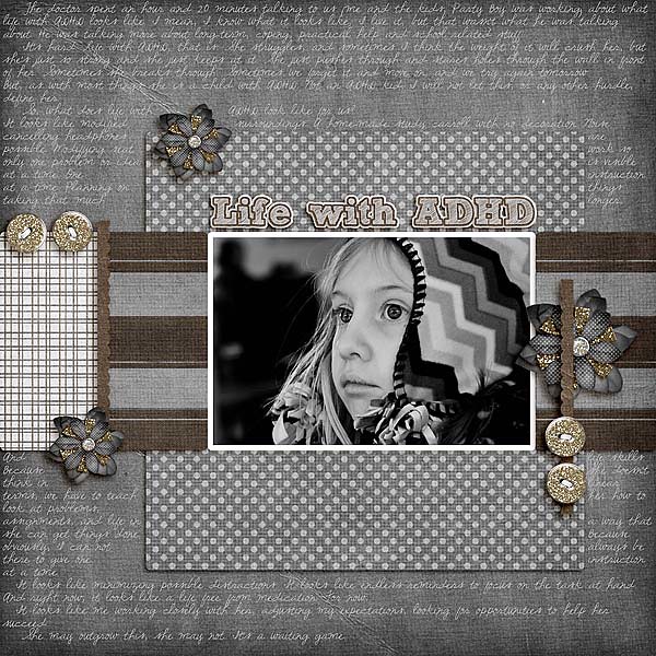
Candy used Standing Alone Vol. 1 Template Pack and Well-Suited by Trixie Scraps Designs. Her hat is bright, bold and multi-colored, so not a good fit for this layout at all. She changed it to black and white to eliminate the distraction of the hat and put the focus back on her face.
Jamie, one of our guest Stars, has this awesome layout to share with us: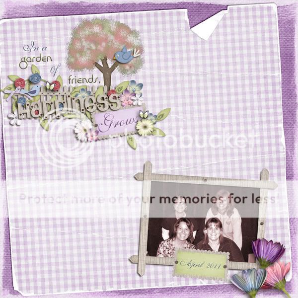
This photo was taken a couple weekends ago at a Women’s Retreat for her church. Since it was an impromptu photo, nobody matched or even coordinated – and the background was a wood paneled wall. So she changed it to a purple hue to soften it and coordinate it with the colors of the Spring in the Meadow kit.
Kris has this beauty to share, using the new Adoption Day kit by Trixie Scraps Designs: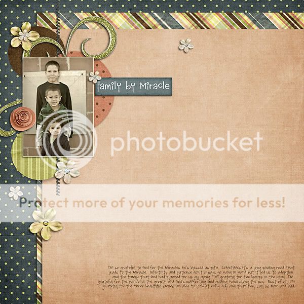
Bree, of course, is a pro at getting her pictures to perfectly match the kits she uses:
The blanket here was yellow, Aiden’s shirt was bright orange and Libby was wearing pink. So of course, Bree needed to tone down the screaming colors for this layout! Bree used Spring in the Meadow by Trixie Scraps Designs

Bree used Croaky Kisses from Trixie Scraps Designs
So now when you find the PERFECT kit for your photos, but the colors do not match, you know exactly what to do! Let’s see what you can do with YOUR photos! Remember to use at least 80% Trixie Scraps products. Good Luck!

All Trixie Scraps Designs products can be found in the following online stores:
Trixie Scraps Shop * Gotta Pixel * Scrapbook Bytes * Funky Playground

