It’s summer and I’m all about making things easier and simpler so I wanted to talk to you about a technique that designers have used for ages: the rule of thirds.
This simple technique is extremely effective in creating fabulous scrapbook pages where the photo is not in the middle of the page! It also gives you a place to start when you are unsure where to put your photos/elements.
What this is: you mentally divide your page into three horizontal spaces and three vertical spaces like this:
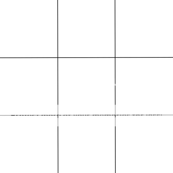
What this does is give you an easy grid to work with. You can even turn on the grid lines in your scrapbooking program so you can visualize it better. Our eyes are drawn to these lines and especially to the places where they intersect. So, if the focal point of your layout is a photo of your child, an easy method of creating a visually attractive layout is to place the picture on one of these lines as I did below. Her photo is on the vertical line at the right (in line with her nose), with the eyes (the focal point) on a place where the lines intersect as follows:
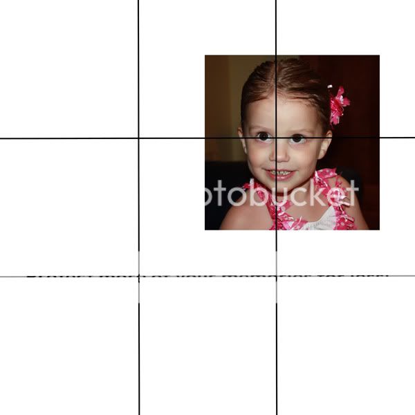
This design is more interesting than constantly having the photo in the middle of the page. Here is my finished layout, with the gridlines still intact:
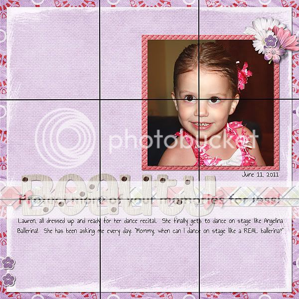
See how I placed the title on the bottom horizontal line too? I really did not want this to be a very “busy” layout as I wanted the focus to remain on the photo, but the large title needed to balance the picture and this works well. Also note how I have two little flowers on the bottom and the same little one top right on the photo, again creating balance. The soft colors in this fabulous kit, Spring in the Meadow, work fabulously with my pretty girl! Here is my final layout:
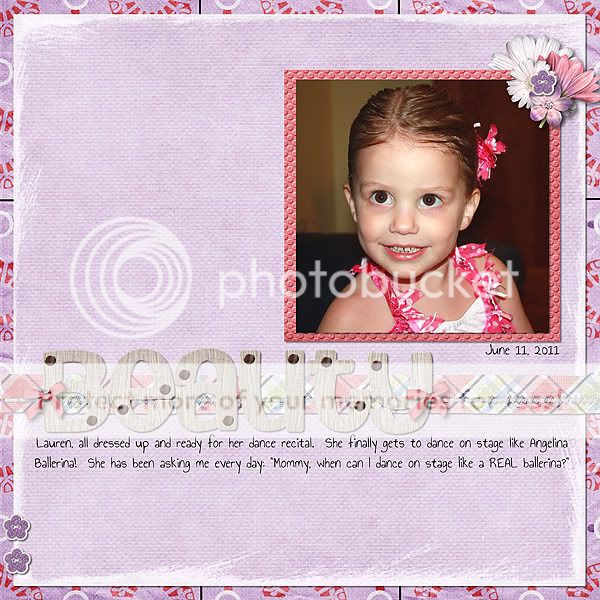
Many templates have also been designed using this technique to make it even easier for you to lay your photos out. So why not give it a try? Good luck creating all those wonderful scrapbook pages with the rule of thirds.

All Trixie Scraps Designs products can be found in the following online stores:
Trixie Scraps Shop * Gotta Pixel * Scrapbook Bytes * Funky Playground





She is beautiful, Carolyn! Great layout, the picture definitely shines in this one! Thanks for the tip!