Welcome to this weeks edition TTT. This week Jamie D. is bringing you a tip on how to enhance the eye flow on your layouts.
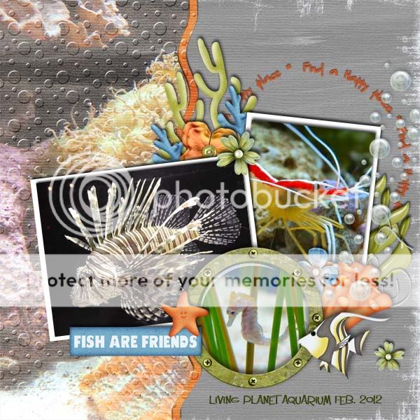
It is important for layouts to be visually dynamic. We want the eye to be drawn into the layout, and we always have a certain spot in mind that we want to be our focus. When you create a layout in the shape of a “Z” this helps with that. Your “Z” doesn’t have to span the entire page, mine for example only covers where the photos are.
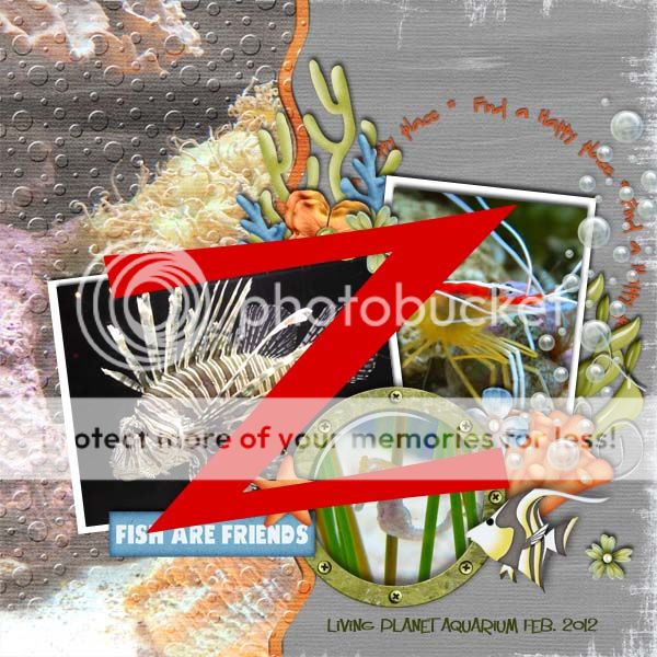
When creating a layout in this format you want place the items that you want people to see first on the top of the “Z”. Then you follow the “Z” shape down the diagonal and back across the bottom with what you want people to see last.
Here is my completed layout.

All Trixie Scraps Designs products can be found in the following online stores:
Trixie Scraps Shop * My Memories * Gotta Pixel * Scrapbook Bytes * PickleBerryPop
