Scrapbooking uses design principles just like art and graphic design. One of those principles is the “visual triangle”. The visual triangle allows the viewer’s eyes to move around the layout while focusing on the most important parts. It is very simple to accomplish – you can use elements like flowers, a trio of photos, or even colors. The important thing is that they are similar in nature. This is one of those things that showing is so much better than trying to explain, so I’ve pulled some layouts as examples. I’ve gone through the Stars gallery here, so you can see how different people use the principle.
Here is one by me using Tuscan Fall, and the triangle is fairly small.
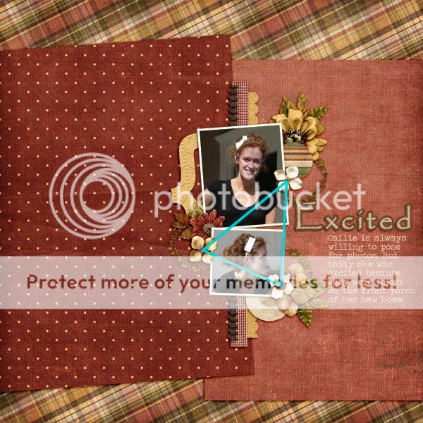
Now this one is by twinsies using Showers of Love, she used the same flower in a larger triangle.
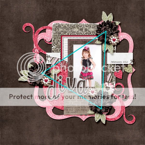
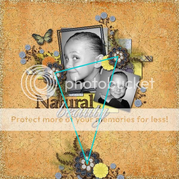
Therapy97 also used the same flower in this layout using Natural Beauty. Her triangle is more elongated, and the dark blue in them really draws your eye.
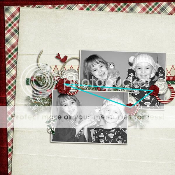
And last but not least is this one by Bree, using Winter On The Mountain. I love how the dark red flowers really help you focus on the photos.
The visual triangle is a very easy principle to implement and I hope you have found this tip beneficial.

All Trixie Scraps Designs products can be found in the following online stores:
Trixie Scraps Shop * My Memories * Gotta Pixel * Scrapbook Bytes * PickleBerryPop
