Good morning, blog readers! It’s Carrin here with you today to bring you a quick little tip on how to use those gorgeous page starters that Trixie has made to coordinate with some of her kits. If you’re anything like me, you’ve shied away from them for the sole reason of wanting to make the page your own. Well, I’m here to tell you that you can still achieve that sense of uniqueness by using the page starters as a stepping stone…and it may just save you some scrapping time, too!
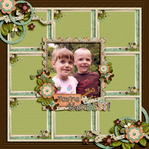
You can do a number of things with these page starters. On this page, using Grand Day kit and page starters, I started by duplicating the flower cluster in the corners of the page starter, then I resized and duplicated the page starter itself, framed it and used it as part of the background of my page. I think it adds depth and interest to the page and lets the photo stand out!
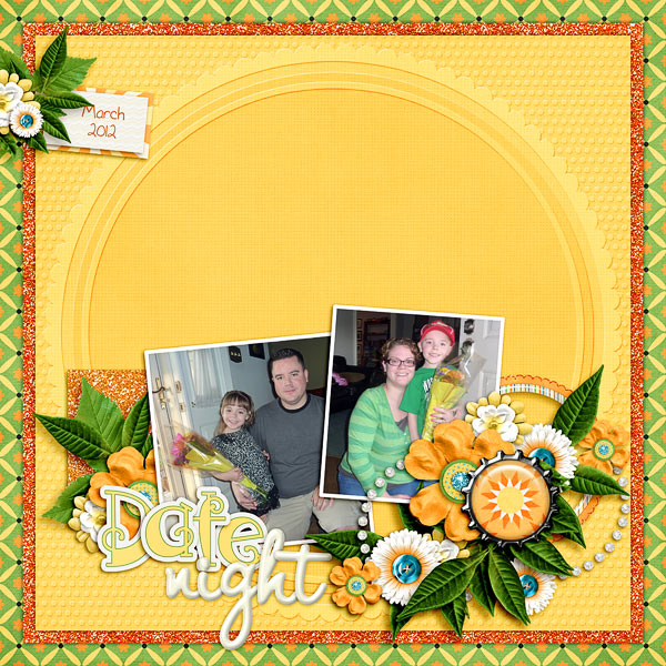
Sometimes, I get a really big brain fart (don’t we all?!?!) and really want to create some amazing clusters, but I just can’t figure out how to get it right on my own. With this page, using Sunshine Day page starters and kit, I took the page starter, placed my photo on the page where I thought it looked best and then used the exact same elements that Trixie had placed in her cluster to create some depth. This may get a little tricky with shadowing the elements just right, but I think it was totally worth it!
Still not sure that using page starters is for you? Take a look at the step-by-step production of this page I did using the Roots and Branches page starters and kit. As I worked, I also added on the Pigskin Party add-on alphas.

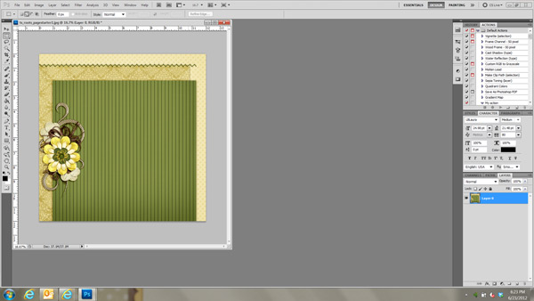
1. Pick your page starter. You may not know at the start exactly where you want to go with it, but that’s okay…you can change it however you’d like as you go along!
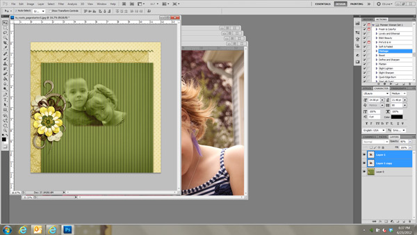
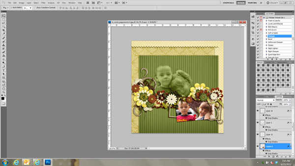
2. I almost always start my layouts by adding on my photos. I wanted to try out the blending technique that Stacy showed us here and since the background paper is relatively solid, I figured I’d give it a go on this page.
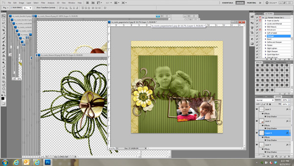
3. Add whatever other photos you want and start layering on the elements. I shadow as I go along, so make sure you are paying attention to the direction/opacity of the shadows on your page starter to make sure your are consistent. A note from Tracy herself on shadowing…”If your are using a Trixie Scraps page starter, I nearly always use a shadow angle of 43 and shadow color #2c1901 set to linear burn and lowered to somewhere between 40% and 65% opacity. The shadow depth and size would vary according to your preference for the element you are shadowing.”
4. Once you’re sure your clustering and element placement is the way you want it, start adding in your title, journaling and date.
5. Voila! Now you’ve got a really beautiful page that you made all on your own…with a little added help from the designer!
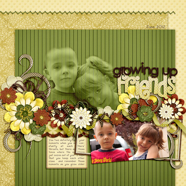
Please remember, these products are called page starters for a reason. They are created to give you a jumpstart on your layout, not take away your ability to make a unique page. I had a lot of fun trying out different things with this page, so know I’m definitely going to use these gorgeous beauties more often! As always, make sure you upload any layouts created with this tip to the Trixie Scraps gallery!

All Trixie Scraps Designs products can be found in the following online stores:
Trixie Scraps Shop * My Memories * Gotta Pixel * Scrapbook Bytes * PickleBerryPop



Great tutorial! Thanks so much!
The rare times I use a page starter, I usually imitate the page starter because I want my photo in between the paper and the elements. But it makes much more sense to just add the photo and the duplicate elements on top. Thanks for showing me the light! 😉