Hey, Trixie fans! Mary Kate here to give another cool tip and tutorial for your digital scrapbooking. Today, I would like to work on looking at shadows when using light colored kits. Yes, we should look at our shadows and how light or dark they are when working with certain kits. I recently had this discussion with Miss Trixie when working with her Day of Grace kit. My shadows were too dark and I had to lighten them to make it look more realistic. So, I learned how to work with the color part of my shadowing to achieve a lighter look. Now, I know I am working with a program that many do not have, but I know this same thing can be found in almost any digital program software. You just need to find where to access it in your program.
Here, I have shadowed some elements my “normal” way.
As you can see, they are dark… not obscenely dark, but enough to distract what I am supposed to be looking at; the photo!
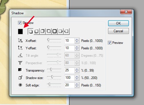
If you look in your program, you should see a little “color” box in your shadowing selection area.
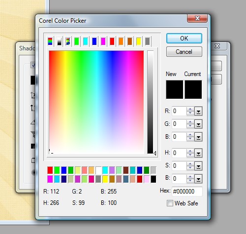
Click on that box and you will see something like this:
Choose a lighter color. For my layout, I went with a lighter grey (R: 62, G: 62, B: 62)
Here is my layout again with my shadow “color” being corrected:
Also, remember that adjusting the color for a realistic shadow is NOT the only thing you have to remember when shadowing. Getting the other settings right is a must… we showed you those settings in our tutorial here.

All Trixie Scraps Designs products can be found in the following online stores:
Trixie Scraps Shop * My Memories * Gotta Pixel * Scrapbook Bytes
