With the launch of Photoshop Creative Suite 5 in 2011 a new editing tool became available that really broadened the scope of how objects could be manipulated. It is called Puppet Warp and it is a tool that allows you to warp objects without creating distortion.
Now, I am far from a shadow expert, but I do love to play with my shadows from time to time, especially on things like banners and strings. You can create a real sense of realism when you tweak shadows and make items appear to be popping off of the page or moving. The process is fairly simple, just follow the step-by-step!
In this layout I am using Summer on the Boardwalk. I just love the banner and it was perfect for the effect that I am going to create. I have pulled my base paper and the banner onto my page already and shadowed the banner. Now, I need to make the shadow a separate layer, so I can edit it independent of the banner itself.
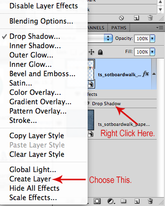
You can do this by right-clicking on the drop shadow layer style and choosing “Create Layer.” This puts the shadow on its own layer and changes your layer stack to look like this:
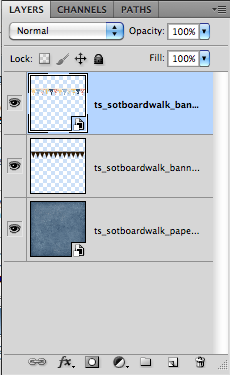
Now that you have a separate shadow layer, click on it to select it and then select “Edit > Puppet Warp”

This wraps your shadow layer in what looks like a tangled mess of puppet strings and will look like this:
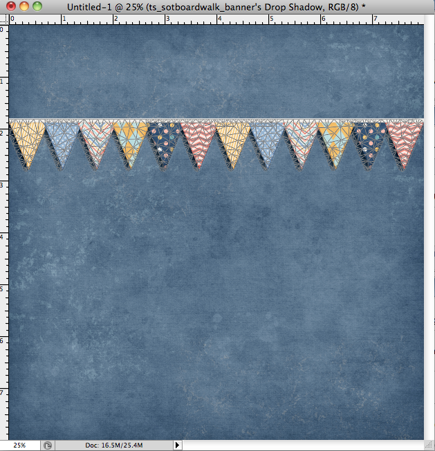
Now for the fun part! We are going to warp the shadow and the flag to make it look like a little breeze blew across our page and ruffled the flag!
First, I am going to pin down the area that I want to warp. This keeps the movement to this layer isolated, so it won’t warp and distort the whole layer. Zoom in and drop as many pins as you need. Remember that you can always undo and try again to get just the right look.
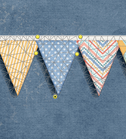
The little yellow dots are where I have “pinned” the shadow layer to the page. The yellow dot at the bottom is where I will click and drag to warp the shadow.
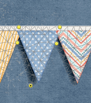
There. I just pulled it back a little bit and curved the tip. It’s a tiny little adjustment, yes, but in the past would have resulted in the entire shadow layer becoming curved and distorted. This little tweak will help to sell the illusion that the flag is blowing away from the page.
Next, I select my banner layer and again choose “Edit > Puppet Warp.” Now, I will warp the flag, again, by dropping pins to “pin” the banner on the page and then grabbing the bottom of the flag and lifting it up and away from the paper.
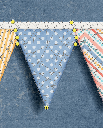
And here it is from a little farther out.

Here is my completed layout – You can se right where I warped the flag and shadow with puppet warp to give a little more dimension!

And here is another layout I did where I used puppet warp to change the shape of the banner without distorting it and also tweak some of the shadows.

There are so many possibilities to explore with this powerful tool, I hope you’ll share your puppet warped layouts with us in the Trixie Scraps Gallery!

All Trixie Scraps Designs products can be found in the following online stores:
Trixie Scraps Shop * My Memories * Gotta Pixel * Scrapbook Bytes


Is this really better than using PSE 8-9 or 10? Is it worth purchasing? I hear the learning curve is awful?
Fantastic tutorial. Thank you so much! I can’t wait to try this. 🙂