It’s Tuesday again, that means it’s time for another Tips, Trends and Techniques Tuesday. This week we’ll show you how to put a sepia tint to your photos.
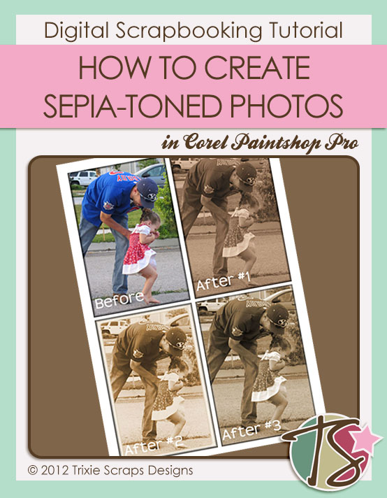
I’m using Corel Paintshop Photo Pro and with this program there are 3 ways to put a sepia tint to your photos. I’ll walk you through them all, and trust me they are all super simple to do.
SEPIA TONING #1
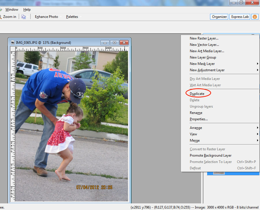
Your first step is to choose the photo you’d like to change the tint on. Once you’ve got that figured out and it’s opened in your photo editing program, you’ll want to duplicate your photo so that you don’t accidentally ruin the only copy of the photo you may have. In the program I use the way to duplicate a photo is by right clicking the photo layer in your layers palette, choose duplicate and you’ll then have 2 of the very same layer and you can delete the layer with your original photo.
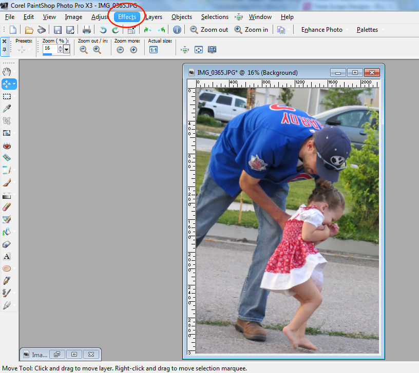
You’ll then click on EFFECTS in your toolbar.
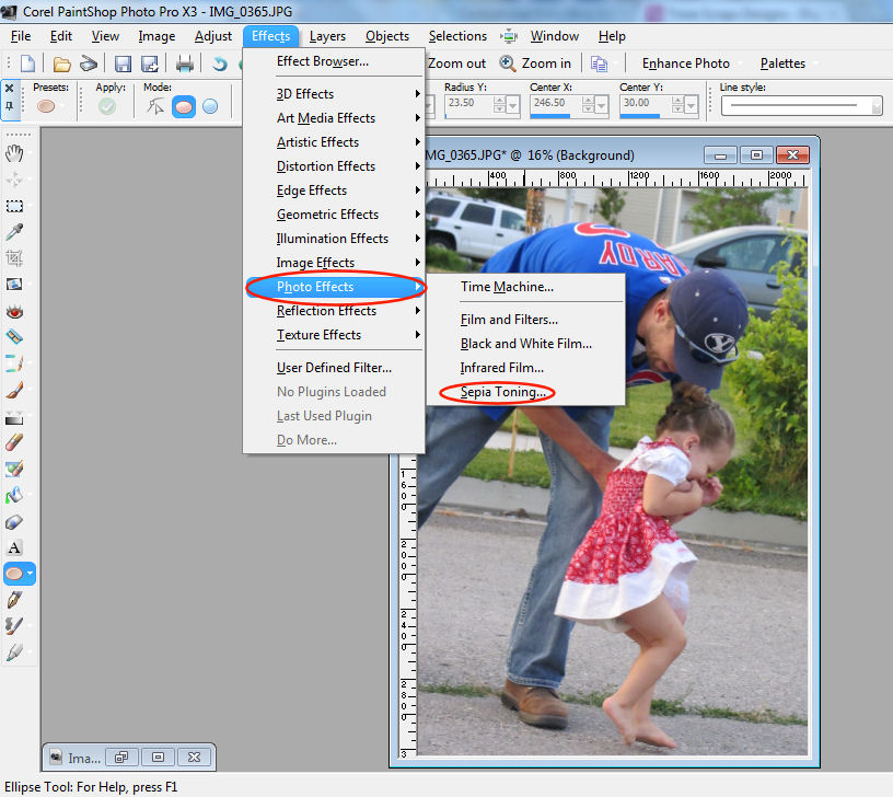
From the effects menu you’ll click on PHOTO EFFECTS —> SEPIA TONING
This will bring up an option box asking how much you want to ‘age’ your photo. The ‘older’ you age the photo the more brown it will be.
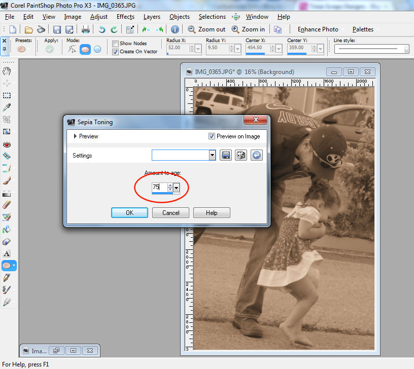
The ‘younger’ you age your photo the more gray it will be.
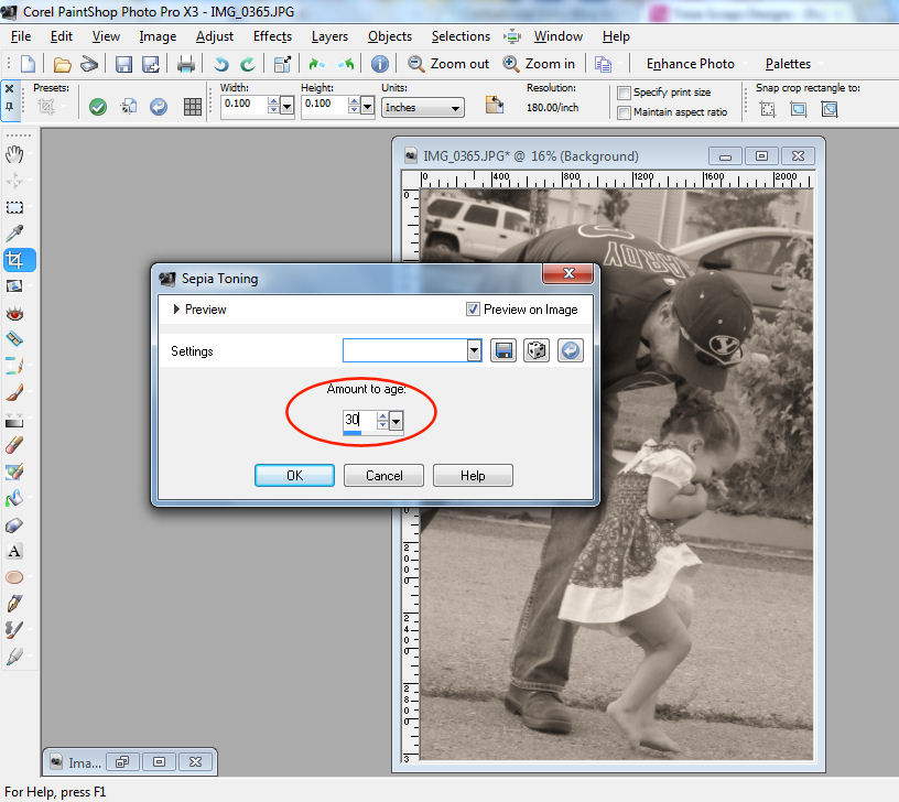
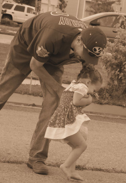
I personally like the look of 75 ‘years’. It seems to be the perfect age for a photo.
SEPIA TONING #2
This is my favorite way to put a sepia tone in my photos, but I’ll admit I’m not sure every program has this capability.
Again, to start out with duplicate your photo.
Then it’s off to the EFFECTS option on your toolbar.

From the effects menu you’ll want to select PHOTO EFFECTS —> TIME MACHINE
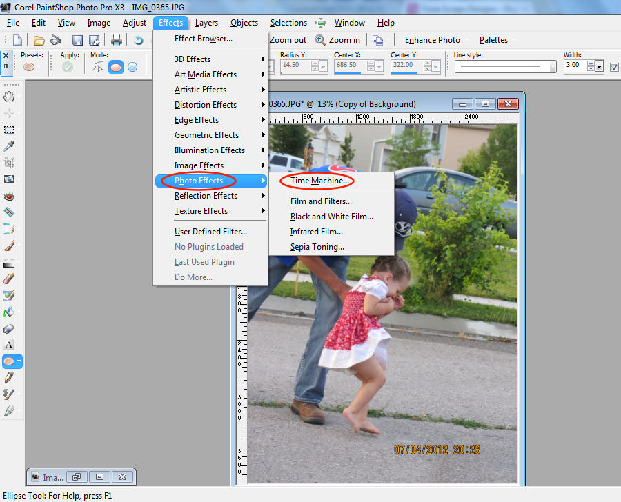
In this menu you’ll want to select the Albumen option.
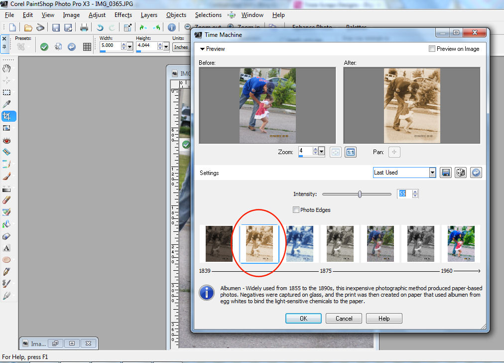
The intensity bar is how you change how much sepia tone you want in your photo.

With the intensity option, the less intensity you use, the more yellow your picture will be. Alternately, the more intensity you use – the redder your picture will be.
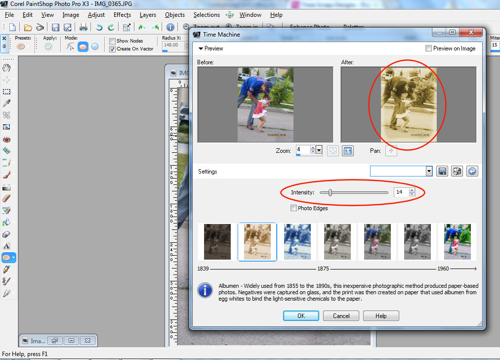
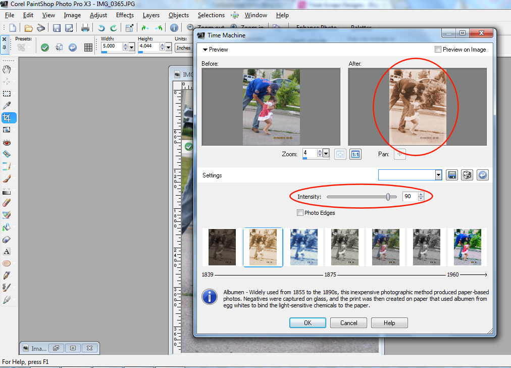
I like the look an intensity option of 55 makes. The other thing I really like about this trick is the option to have a frame put around the picture. It really adds to the look for me, although it won’t always work for your scrapbook pages – so make sure you click the option on or off depending on what you are doing.
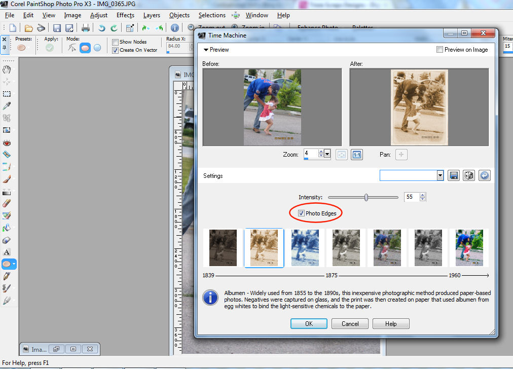
I can’t tell you how much I like this look.
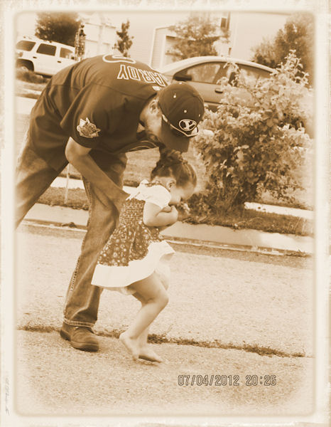
SEPIA TONING #3
At the risk of sounding like a broken record, duplicate your photo before you do anything else.
Click on ADJUST in your toolbar.
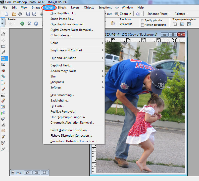
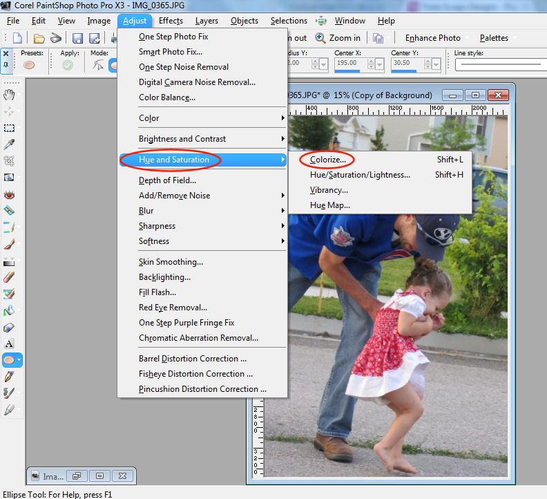
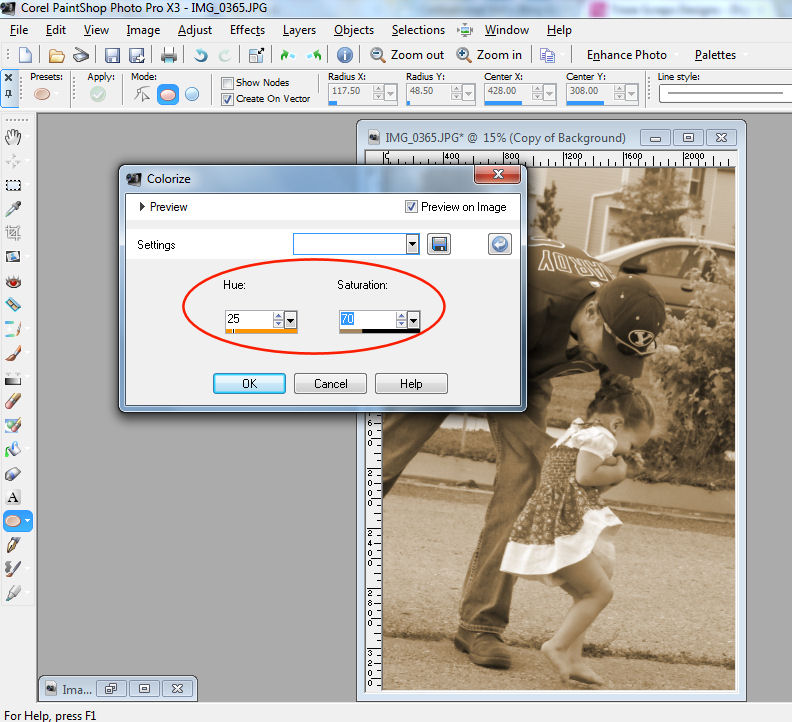
From the adjust menu you’ll click on HUE & SATURATION —> COLORIZE
The hue and saturation sliders are what you want to play with to get the look you want.
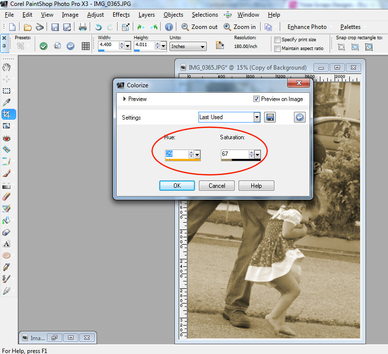
This option isn’t quite as forgiveable as the other options. As in, you slide one slider too far – you’ve got another color option all together. I found that the combination I like best to get that sepia tone is a hue of 25 and a saturation of 70.
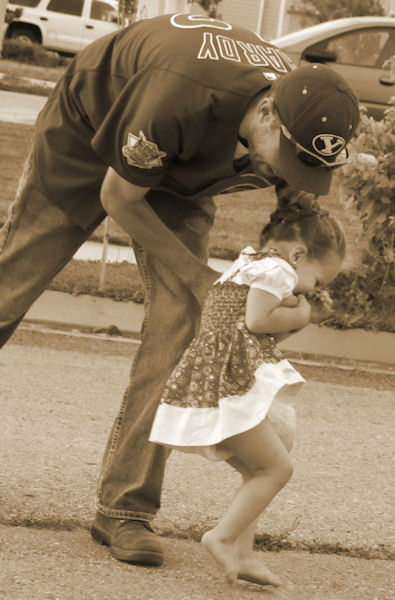
And there you have 3 different ways of putting a sepia tone in your photos. Happy Toning!!!

All Trixie Scraps Designs products can be found in the following online stores:
Trixie Scraps Shop * My Memories * Gotta Pixel * Scrapbook Bytes



I live option 2 with the frame! Wonder if my ancient version of PSE can do that?