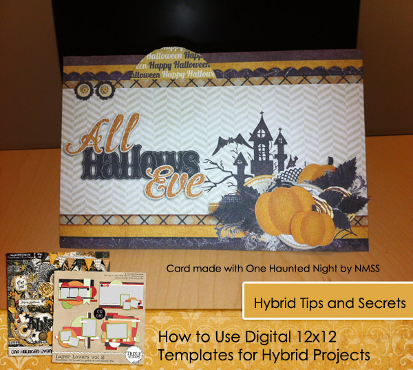
Hello Trixie fans, have you ever thought of using a digital template to help you design a hybrid card, layout, or project? Well, I use them all the time and I’m here to share some of my secrets for using them. I often use templates to aid me, especially when I’m beginning my hybrid process. When I begin with a blank canvas, sometimes it is difficult to get started. I found using a digital template can be very helpful! For today’s example, I used Layer Lovers Vol. 2, and One Haunted Evening Collab by Trixie and Connie Prince to help me create a hybrid Halloween card.
More and More Layers!
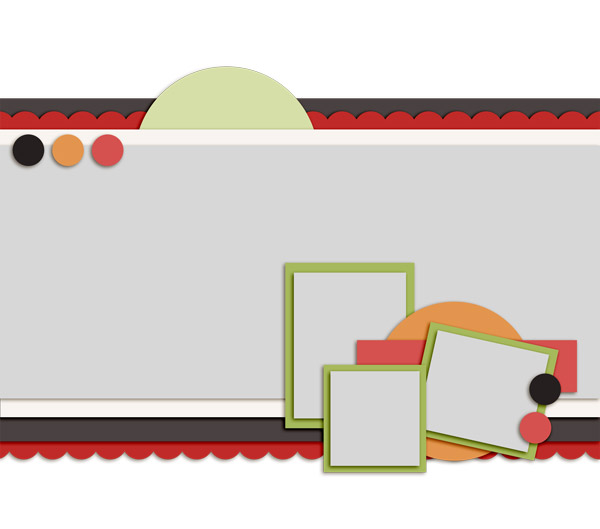
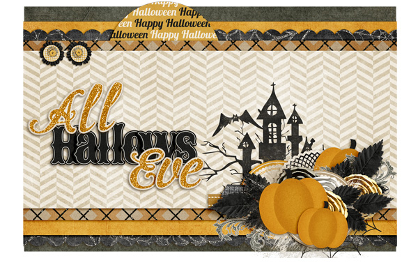
When making a traditional card, you must cut out all those paper layers and attach them with precision. But with our digital tools and a great template, we can make sure those edges are straight and layered exactly the way we want with ease. When you use your favorite digital kit and layer those patterns with different shapes and sizes, it will create such a beautifully defined hybrid. Today I used Layer Lovers Vol. 2, I modified it by resizing it to 4×6, and layering elements in place of the photos and papers in the corner.
Original template
Front of the card in PSE
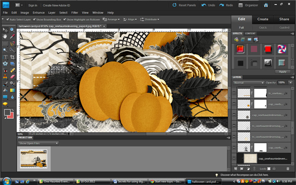
Clusters and Shadowing
You can create element clusters digitally to add to your hybrid card or other project. No need to worry about all that glue and mess. Not to mention the forgiveness if you make a mistake, with a simple click you can relocate that flower or paper. Just don’t forget those shadows! Shadowing all your layers will make the project pop and look realistic. Think about the different materials you are using on your digital design. Cardstock will have a less defined shadow, than say a button or flower, unless you are using a foam dot to prop it up higher. Flowers require more of a shadow since they catch more light and are layered higher off the background than other elements. Notice how the leaves are higher up and catch more shadow underneath than the circle paper tags since they will lay almost flat on the card. When shadowing digitally, you should also think about the angle of your light source: when sharing your project, will it be standing straight up, like a card displayed on a mantle, or maybe it is sitting in the lap of your viewer, like a scrapbook page in an album.
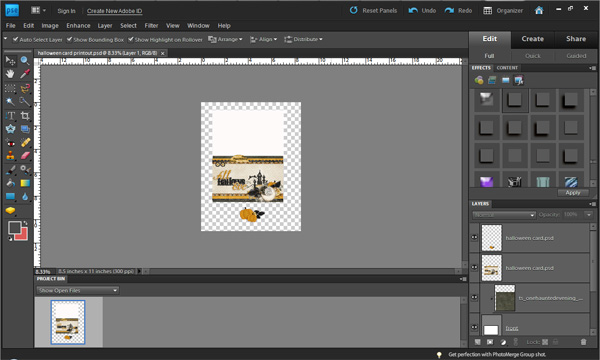
Printing
When designing my card, I figure out which layers I will print together and which layers to keep separate. Most of the time I leave my paper layers to print out together, I also use foam dots to prop up any layers I want higher up off the page. I find, the less cutting, the better, but that’s just my personal preference. Here’s a screenshot of my printout. You’ll see I choose to separate the top pumpkin cluster from the rest of the large cluster. I also cut out the top circle to add some more dimension, after printing.
Who knew you could create such a beautiful project, with the help of your digital tools? I hope this inspires you to create! And don’t forget to share with us if you use any of Trixie’s products!!

All Trixie Scraps Designs products can be found in the following online stores:
Trixie Scraps Shop * My Memories * Gotta Pixel * Scrapbook Bytes



Wow! For years, I’ve thought that hybrid was a colossal waste of ink (why not just use paper???) – but you have finally shown me a real use for hybrid. Awesome! thanks so much!