Alphas are a fun addition to any kit. They can make your title work much easier and takes the guess work out of it. However, sometimes an included alpha just doesn’t fit with your layout. It could be that the colors are wrong, or that the font and style of the alpha just doesn’t work with the feel you are trying to get your layout to make.
Don’t worry. There is a way to work around this. You can create your own alpha. Today, I’ll show you how I do this.
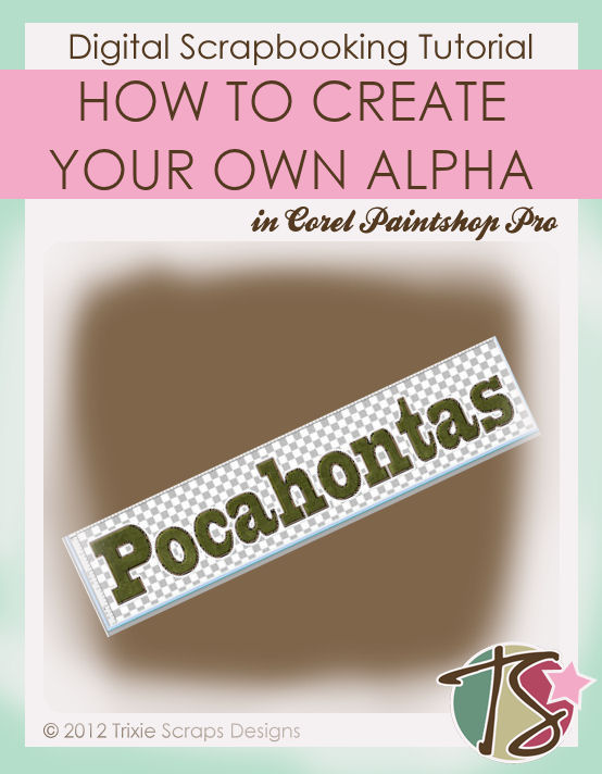
You are welcome to make a full alpha using this tutorial, but I like to just do the word I need. I don’t usually reuse an alpha that I make since I usually make it to go with one layout in particular.
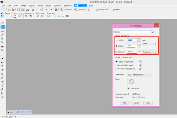
I first created my layout up to the point of the title. I then guesstimated what size to make my new project (word). It’s okay if you don’t get the size quite right, you can always resize when you add it to the layout. Make sure you err on the side of too big though.
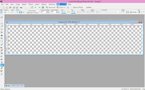
The next step will be to choose your font. This step was probably easiest for me as I had used the font previously for the project my layout was about.
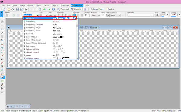
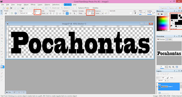
Then go ahead and type your word or full alpha out. You want to make sure of a few things when doing this. You want a font that is fairly thick to begin with. Then you want to make sure your color selections are both black, your stroke width is 0 and your font is big enough that it will show up right on your layout.
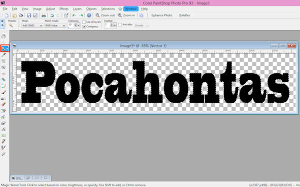
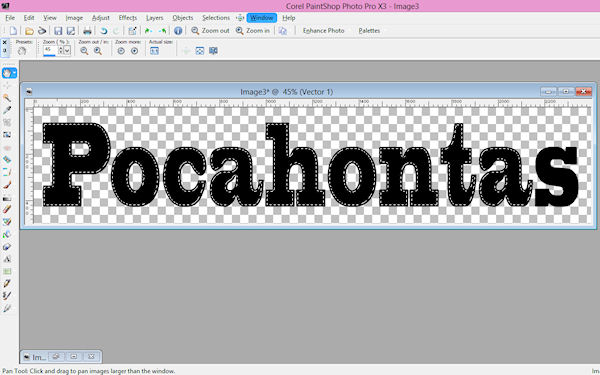
Once you’ve got all the above correct and your word/alpha is all typed out, you’ll want to select your magic wand tool and select each letter.
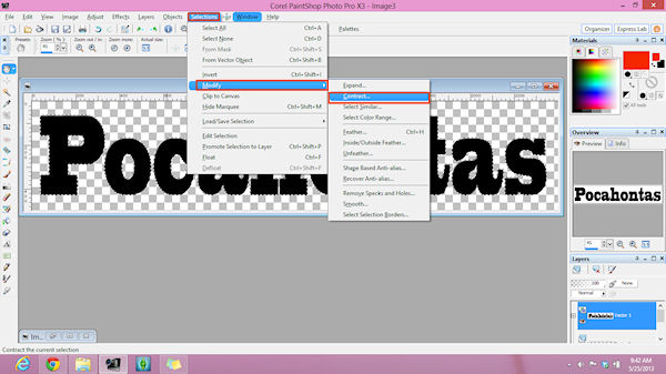
Next you’ll need to modify that selection slightly – unless you don’t want a think black outline with your alpha.
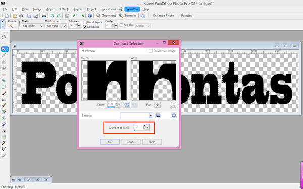
Because I only wanted a think black outline left, I only contracted my selection by 10 pixels.
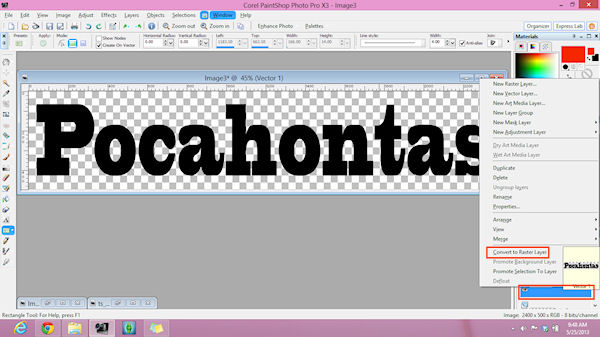
You then want to convert this vector layer to a raster layer. (If you haven’t already)
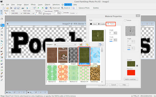
You can then flood fill your word/alpha with whichever paper you want from your chosen kit.
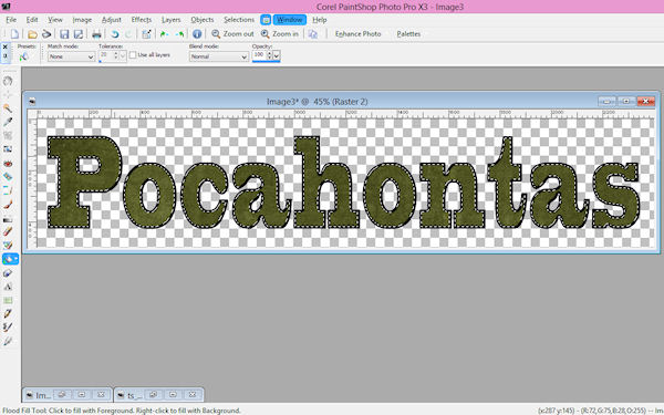
You can stop here if you’d like. You have an alpha that looks pretty good, but if you want to make it just a little more fun – keep reading.
Do you want to make your alpha pop a bit? You do that by playing with an inner bevel. There are tons of options in the inner bevel window that you can play with to change the appearance of your alpha.
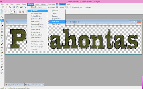
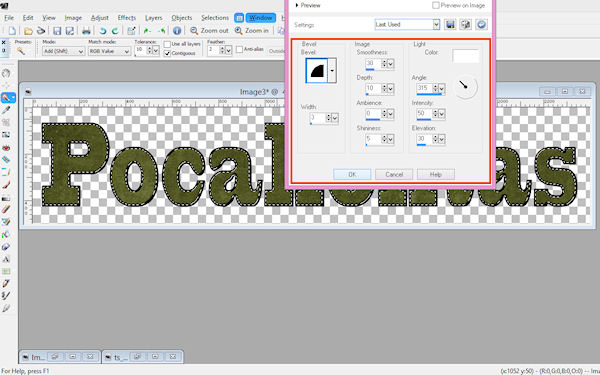
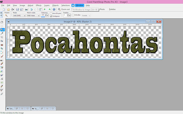
Again, you could stop here and have a working alpha – but I went on just a bit more. I decided I wanted a bit of white behind the alpha. So I selected the outside of each of my letters.
I then needed to expand my selection.
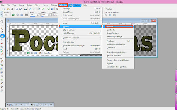
After the selection was expanded, I made sure to create a new layer and then I flood filled my selection with white.
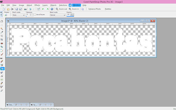
You’ll end up with your word whited out, this is where you’ll need to rearrange layers. You’ll want the paper flood filled layer on top of the white layer.
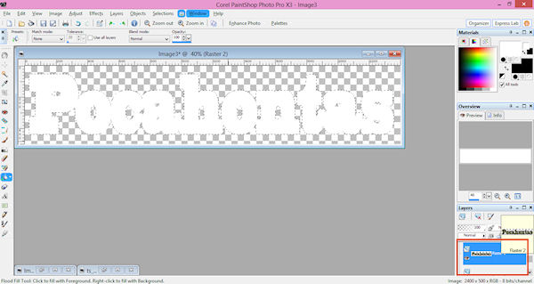
When that’s done, you’ll merge all layers together and you’ll have your alpha.
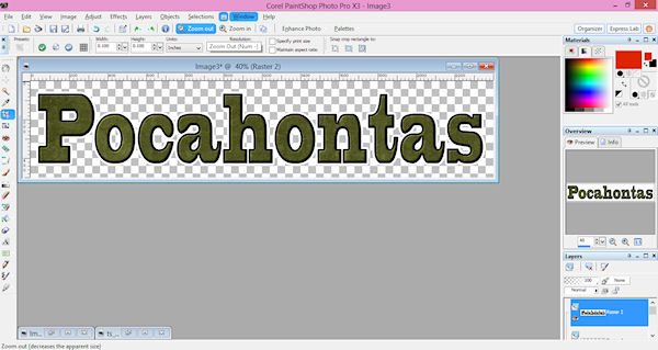
From here you can either save your work (if you created a full alpha), or you can copy and paste your word onto your layout. I lucked out and my guesstimate for size was perfect. Here’s my completed layout with my own alpha.
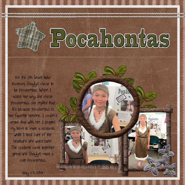
I used Great Wilderness Lodge for this layout. I’d love to see what kind of alphas you can create for your pages, so go ahead create some and then share your layouts in our gallery.

All Trixie Scraps Designs products can be found in the following online stores:
Trixie Scraps Shop * My Memories * Gotta Pixel * Scrapbook Bytes * Ginger Scraps





This is GREAT, I shared this on the digiscrapaddicts FB page and wanted to invite you to also post in our tutorials section here https://digiscrapaddicts.com/forum/forumdisplay.php?f=92
Have a fantastic day!!