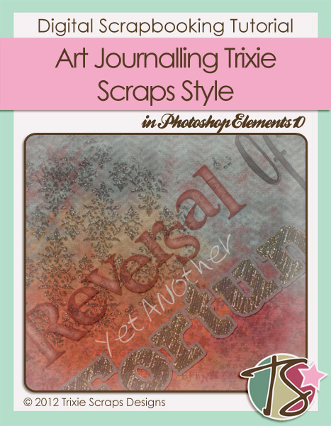
So here we are on the downhill side of 2013. Time’s just flying; now that half the year is gone maybe some of you are evaluating where you are and where you want to be by year’s end. That kind of soul-searching calls for some awesome art journalling. I bet most of you don’t think Trixie’s designs – being generally quite cheerful and bright – lend themselves to that style of scrapping but I’m here to show you how wrong that notion is! Pretty much everything I’ve used in my layout came from my Trixie files, except for basic brushes that came with my Photoshop Elements software and some brushes from Haunting My Sleep (Grunge Streaks 1) and Green Eyed Lady Designs (Vintage Writing 2).
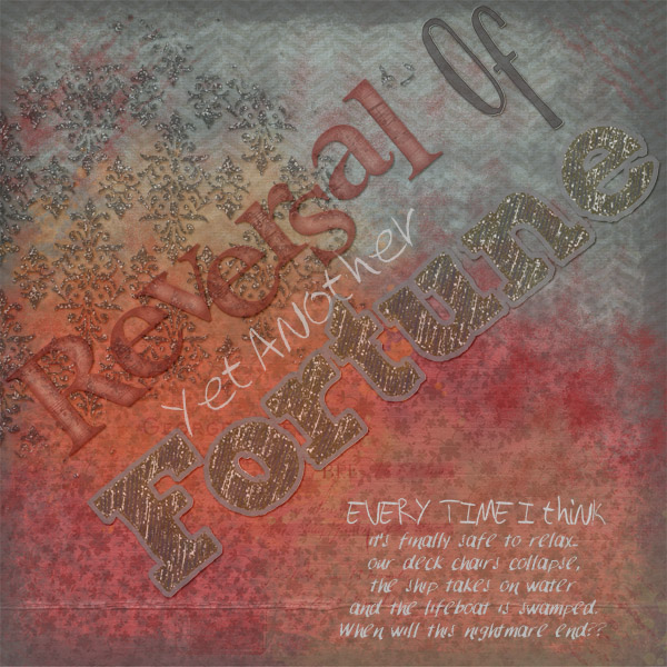
Papers: Distinct Hush, Hints of Fall (add-on) and One Haunted Evening. Blended glitter smear: Black Tie Event. Painted border: Heart of a Friend. Paint smear: Seriously Stressed (retired). Template: Blend with Me V.1 Template #2. Alphas: After 10 Years, Posh Party and Prima Ballerina.
If you do a folder search of all your lovely Trixie Scraps stash using the keyword “paper” you’ll discover that most of her kits have some beautiful grungy papers. That’s where you start. Select some papers that fit with the theme of your musings. I was angry and disappointed so red, orange, grey and black were natural choices for me. I also used a blended template, discarding all the embellishments and only keeping the background layer and blended photo layer. Being moody doesn’t necessarily mean ugly, so I opted to include a glitter smear and then I chose some alphas that reflected both mood and emotion; I did a little selective recolouring to achieve the look I wanted. I decided to use chalkboard fonts for my journalling. Your art journalling layout may reflect joy, pride, contentment, sadness, anger or any other emotion under the sun.
Putting it all together:
The key to art journalling is blending. Blending and blending some more. Start with your darkest paper then blend a second, lighter patterned paper with it by adjusting the opacity of your second paper. Keep adding patterned papers of varying opacities until it looks right to you. If you want to blend two colours of paper as I’ve done with the red and dark grey, you can use a blending mask – one you’ve purchased or one you’ve made. (Maybe that’s a Masters Monday topic for another day?) Next, start adding brushes. Decrease the opacity to somewhere around 40% and overlap them to deepen the colour in spots. Keep layering on brushes until you like the way it looks. Then you can add doodles, shapes, blended photos and whatever else you wish to incorporate. Don’t be afraid to adjust colour to suit your mood. (The painted border I used was originally an off-white but it looked seriously awful that way, so I made it grey. The Prima Ballerina alpha looked okay in its original colour, grey, but I thought it had more oomph in red.) Your journalling can fill the whole page, or just a corner. You can choose to have a title on your page, or leave it out. It’s all up to you.
Give it a try! It’s not as hard as it looks.
~Jan

All Trixie Scraps Designs products can be found in the following online stores:
Trixie Scraps Shop * My Memories * Gotta Pixel * Scrapbook Bytes * Ginger Scraps
