Wowzers… today’s the very last day of September! How did that happen?
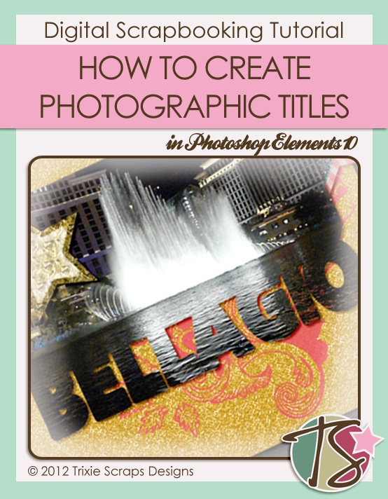
Today’s tutorial is a really simple one, but with great potential for adding some zip to your layouts. I’m going to show you how to create photographic titles!
There are a few ways to make this work, but the technique is basically the same. I chose to connect my title to my photo, but you can certainly have your title separated from your main photo, you can have a different photo for each letter, you can adjust the size of your letters to suit your photos… play with it and find your own groove.
Start by opening a new file on your workspace. I usually go with a 12″ x 12″ file to start with so I have lots of room to manoeuvre, then I crop it down when I’m happy with it. I opted to use a rounded rectangle for my main image. For the letters in my title, I used a font called Flat Bread, but any large, bold, solid sans serif font would work. (For example: Boulder, Broadway, Cuckoo, Herald, Impact, KG The Last Time, LD Fill In – filled in!, LD Zoot Suit, Mama, Pusab, Showboard Gothic… there are lots that would work!)
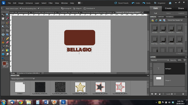
I resized the letters with constrained proportions until they were the same width as my rectangle, then moved them so that they overlapped the rectangle a bit. I wanted to use a 4″ x 6″ photo so I turned on my grid to make sure my rectangle and title were going to fit that 3:2 ratio perfectly. I had to stretch the font just a smidge but I think I like my title better this way.
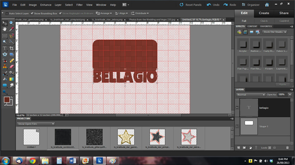
Then I cropped.

So now I’ve created a clipping mask. (I LOVE to use clipping masks. They make things easy.) I started putting together my layout, located my clipping mask where I wanted it then clipped my photo to it. You can easily resize your mask and photo to suit your needs.
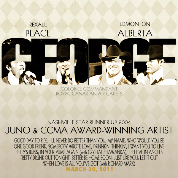
This is where you can get really creative. If you want to use a different photo for each letter, you can either put each letter on its own layer then clip your photos, or you can line your photos up cropping or overlapping as needed then clip. Once you’ve got it looking how you want, then you can merge the layers or leave them separate. For this movie poster layout I started out with each letter on its own layer then moved them so that they touched. The photos are overlapped and trimmed so that one photo could span more than one letter.
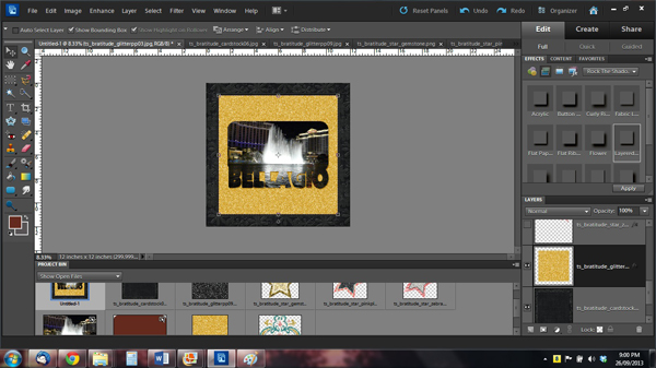
Once my Bellagio layout was finished, I wasn’t quite satisfied with how the title looked. It seemed to almost disappear in the middle where the reflections on the water are so much lighter (see what I mean in the screen shot above), even with a drop shadow behind it. So I used a brush on the paper background and it popped so much better. This is how I finished it off.
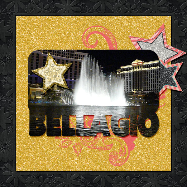
There you have it! I hope you give this technique a try and that you like it enough to use it again and again. Of course, as always I’d love to see your efforts in the Trixie Scraps gallery where I can compliment you on your skills!
~Jan

All Trixie Scraps Designs products can be found in the following online stores:
Trixie Scraps Shop * My Memories * Gotta Pixel * Ginger Scraps
