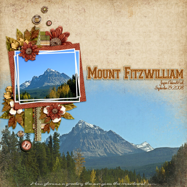
Holy moly, the weather has changed its mind pretty rapidly up here in the north. Last week it still felt like summer and now there’s definitely fall in the air. When I was thinking about fonts that would capture October, I kicked around leafy, curlicue-y fonts, spooky Halloween-y fonts and some other sort of fall-ish fonts then I found Collegiate Heavy (Click Here) and knew it would be just right for titles. After all, October is the real start of the football season, tailgate parties, Homecoming… so what better than a font that looks like it belongs? This font is so cool. I filled in the space between each letter and its outline, but you could leave it as is and have your background show through. I love to use fonts for titles and to make them look like they’ve been die-cut or are stickers. (Hint, hint… might be a tutorial about that somewhere around here.) I know you’re dying to see what it looks like, so without further ado…

I used a template from Blend with Me Volume 1 and the awesome Tuscan Fall for my layout. The caption is a quote from John Muir.
Now then, I’m anxious to see what you choose to do with this font, so make sure you post your layouts to the Trixie Scraps Gallery so I can oooh and ahhh over them!
~Jan

All Trixie Scraps Designs products can be found in the following online stores:
Trixie Scraps Shop * My Memories * Gotta Pixel * Ginger Scraps


