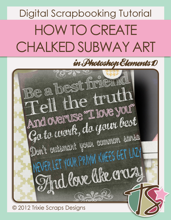
Hello again, faithful readers. Today’s little tutorial is a departure for me, in that it’s pretty simple, doesn’t involve a lot of reference screen shots and is a mashup of two popular trends – chalkboard and subway art.
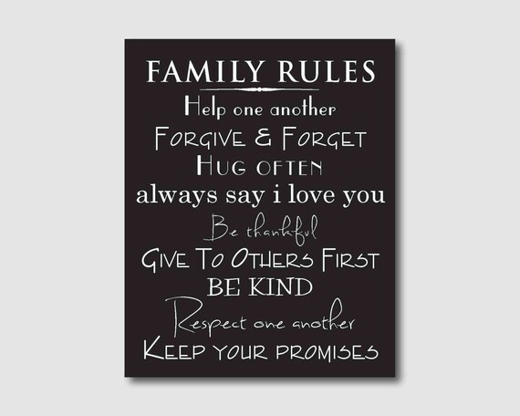
You don’t have to have any specific supplies for this technique, just a grungy solid black or dark gray paper and an assortment of fonts. Street art, according to that authority on all things Wikipedia, is visual art created in public places outside the context of traditional venues and usually without permission. Or in other words, it’s graffiti. Chalk is impermanent and therefore slightly more forgiveable in the artist’s eye. Restaurants and pubs have capitalised on street art, using it for their menus and to advertise their ever-changing specials. Subway art uses a variety of font styles to convey a list of related items, such as types of coffee; it may be used for definitions or verses or any other purpose the artist chooses. This example from Susan Newberry Designs is a list of “house rules”.
So let’s get to work creating our own version of chalkboard subway art. Decide what you’re going to say; you could use song lyrics like I have, make a list of holiday greetings, describe a familiar object or whatever makes you happy. Open a new file on your workspace then drag and drop a dark solid slightly grungy paper onto it. I used one of the solid papers from Trixie’s One Crazy Kid kit. If you think the colour is too dark, you can lighten it: Enhance>Adjust Color>Color Variations.
Good chalkboard art has a variety of flourishes and swirls on it. I opted to do this step first so I’d have some sort of anchor for the rest of my design. So take a look at your collection of fonts, dingbats and brushes, then choose a swirly flourish that will work with your theme. If you don’t have anything that works, there are a number of sites where you can download free fonts, dingbats and brushes. I used a dingbat for mine from DB Flornaments and off-white.
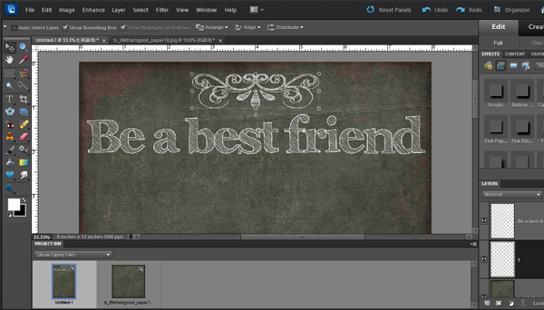
Now for the fun part! Choose a font you like for your first line and put it on your paper. Use either white or a chalky pastel colour. Make sure the colour is light enough to be read against the background colour. When you like how it looks, simplify the layer and move on to the next line. You have to simplify each text layer as you go, otherwise when you select the text tool, it’ll default back to the layer you just finished – AND to the font. Adjust each line for height and width so that you have justified edges. You want your design to look like it’s on a chalkboard. Continue on until you have all of your lines of text in place and looking the way you want them to. At the bottom you can add another flourish, or you can do as I did and copy the one you used at the top, only flipping it vertically so that it’s a mirror image. The fonts I used, in order (and all free!) are DB Flornaments, Archistico, Handwriting, KG Skinny Love, Marcelle Script, Noodle Shadowed, Eraser, Chalk Hand-lettering Shaded and DB Flornaments. I wasn’t totally happy with how “clean” it all looked – after all, chalkboards are usually a little grungy and chalk writing isn’t ever crisp and clean – so I added another layer on top of all my text layers. Then I used a misty brush and one of the tones from the background paper then lightly brushed here and there over all of the text to make it look more real. The last step I took was to align all the edges. When you’re finished, you can crop it to size and maybe add a narrow frame to it if you like. (There’s a good one in Trixie’s Picture a Family kit.) This is my finished word art.
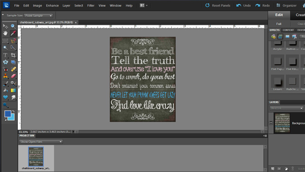
Then I used my word art as a journalling card on a layout…

There are lots of ways you can use this technique. You could make a holiday card, an art journal layout, a journalling card… really, the sky’s the limit. I’d love it if you gave it a try and then posted your efforts in the Trixie Scraps Gallery. Now have a GREAT week!
~Jan

All Trixie Scraps Designs products can be found in the following online stores:
Trixie Scraps Shop * My Memories * Gotta Pixel * Ginger Scraps

