Happy Monday everyone. I hope you’re all gearing up for a wonderful New Year’s. I know that a big tradition for my family has been playing board games all New Year’s Eve. I also remember as a kid that my dad was constantly playing Scrabble with his parents. There were a few times my mom had to take all of us kids home so that Dad could stay and finish a game and he’d get a ride home from his parents or a sibling. These games were intense.
Lately, I’ve been seeing tons of home decor type crafts using Scrabble pieces and I’m about ready to jump on board with that project as well, but I thought that it’d be fun to use in a scrapbook page as well. So this Master’s Monday I’m bringing a love of board games, a memory and a craft trend all together to bring you a tutorial on creating your own Scrabble tiles.
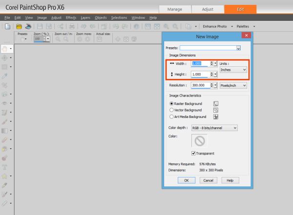
I did some searching to find the exact dimensions of a regular Scrabble tile and the answer I got was .75 x .75. So our first step is going to be creating a new project with the dimensions of 1 inch x 1 inch.
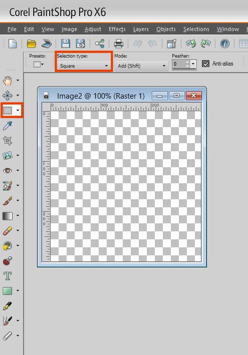
After we’ve got our new project ready to go. We are going to use our selection tool with a square shape.
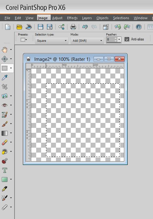
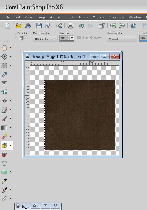
I then started making my selection. I started in the bottom right hand corner at the first full square of the grid and went until I was happy with the shape. I wanted to leave a bit of room on the side for some dimension.
You will then flood fill your square with your wood like background.
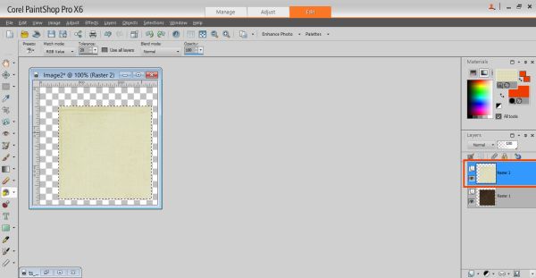
Now the background paper I used from the kit I was using was a bit too dark, so I decided I’d create a new layer and fill it with a lighter shaded paper and then I’d merge them together to get a shade I wanted.
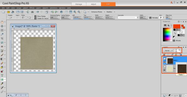
I soon discovered that having the lighter shade on top was not doing what I wanted to do, so I put the lighter shade on the bottom and played with the opacity of the darker shade until I was happy.
Now create a new layer and then select the selection tool in the shape of a rectangle.
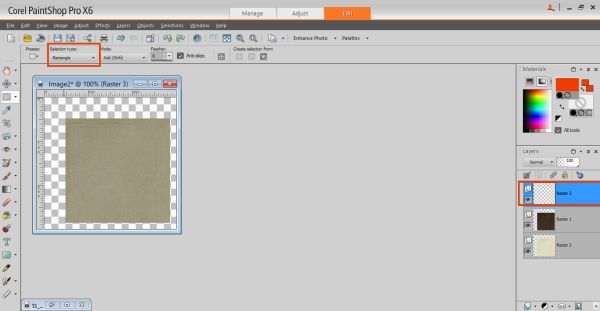
I did a very small rectangle because we just want to show the side of the tile. You then flood fill this selection the same as above.
Then if you used two backgrounds like I did, you’ll want to merge the two layers. The best way to do this is to make sure you are on the top layer and then just select merge down.
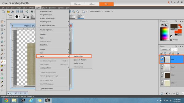
You then have a square and a rectangle piece hanging out together. We are going to make the edge look a little more like an edge by erasing the top part of it in a diagonal.
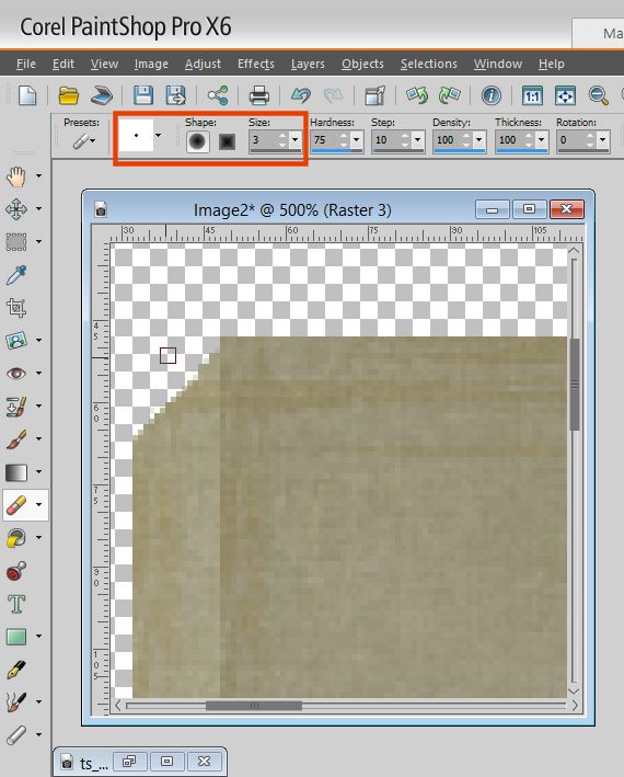
You don’t need to erase much and you’ll want to zoom in and use a small size eraser. You just want to make sure your design looks like it’s not just 1 sided.
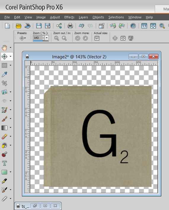
You will then have your tile. I would save your work at this point and save as a png. This will come in handy later.
You are then ready to put your letters and letter values on. Searching Google led me to believe a close font to the actual Scrabble tiles is a font called News Gothic. You can really probably use any font you want – it really just depends on the look you want. I also needed to find out the correct values and since I don’t have the actual game I did a Google search. I used a font size of 32 for the letter and a size 10 for the letter value.
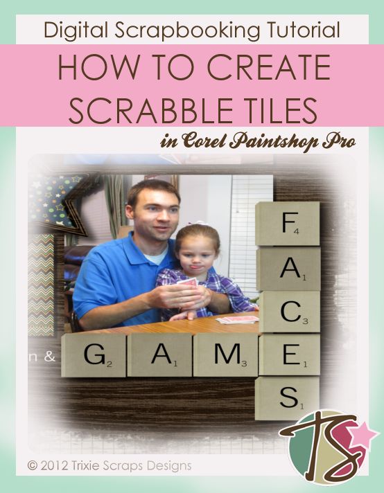
You are now ready to use the tiles in your layouts. If you notice in real Scrabble some tiles are darker wood and some are lighter. If you want to mix it up, just play with the opacity levels on your saved png file. Then you can mix it up a bit. Here’s my completed layout. I used Triumphant for the kit along with the Collage Collecters Vol. 1 template.
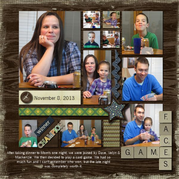
Now I’d love to see how you all use tiles in your layouts. Share them with us in the gallery.

All Trixie Scraps Designs products can be found in the following online stores:
Trixie Scraps Shop * My Memories * Gotta Pixel * Ginger Scraps

