Happy Saturday everyone, Shauna here and today I’m going to show you six layouts with multiple photos. The layouts are all created by my fellow Trixie Scraps Stars and use more than one photo. I don’t know about you, but I struggle using lots of photos on page, so I thought I would show you some I found and talk about what I like about them.
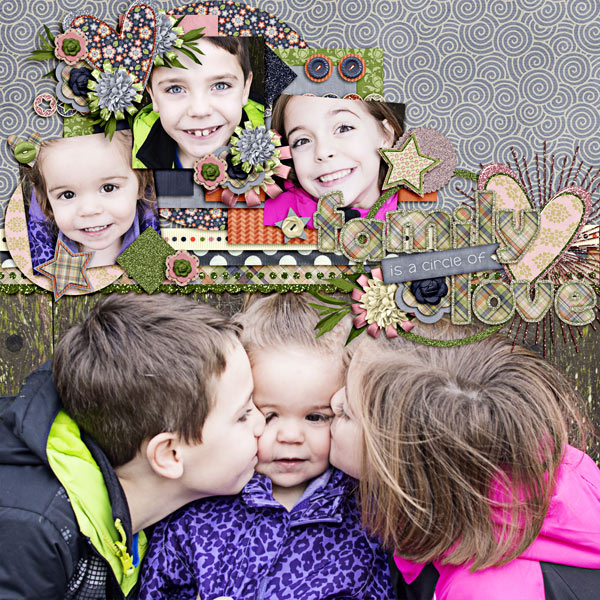
First up is a layout by Carrin and let me just say if I could scrap like anyone else I think I would pick her. I picked her Circle of Love layout, because she used a mix of a large photo with three smaller photos. Now if the large photo wasn’t cute enough, she added the smaller individual photos, and what I really like is that she set them at angles to contrast the straight photo at the bottom. She also did a great job of layering the photos and papers so that there is a real depth to the page.
Next up is a Layout by Mary Kate. Again this one has three photos, but I love that she used different shaped photos and something even cooler. She uses a large blended photo to draw the eye. I think the flow of this page is great and her daughter’s smile just makes me smile. She used the kit We Love Soccer.

Layout by Mary Kate
Now I have a layout by Stacy that is more block like in nature, and is a great way to show off lots of photos. This layout has 5 photos and they are a good size, but because she used the block layout the page doesn’t feel overcrowded. She manages to get a title, date and quote onto the page as well. Plus I love a girl that has the style and flare to wear a pink hat! The kit she uses is Scouting is for Girls and a template from Stampers Block Vol. 1. And if you are like me and struggle with a certain type of layout, templates are a great place to start.

Layout by Stacy
The layout Water Hockey by Stacey is a great layout showing 3 equal sized photos in a straight forward layout. But she really jazzes the layout up and draws my eye to the photos by her paper layout and clustering. Her use of the striped paper and banners really create a sense of movement and your eyes naturally flow down the page. She used My Brother, My Pal and a template from A Banner Day Vol. 1. Now on the template she used, she flipped it and I think it works great, so don’t be afraid to flip a template it may work even better for you.

Layout by Stacey
Now talk about photos, Laugh by Jennifer is packed with them, not just a couple but 16 photos on the page. With that many photos on the page they could get overwhelming, but Jennifer did a great job of lining them up like film strips so there is a progression on each series of photos. The photos aren’t large, but you get a real sense of movement within them. I also really like how she tucks elements behind the photos as well as places them on the top of them. And the title is perfect because it does make you laugh. She uses the kit 100 Days of Happy.

Layout by Jennifer
And last for today is a layout by Shilo. She uses a mix of one large photo with several small photos. The large photo draws your eye simply because her daughter is beautiful, but the small photos make you laugh because they are silly. I love the mix of serious and silly, because I think life is a mix of serious and silly. She uses Frosted Windowpanes and a template from Large & In Charge Vol. 2.

Layout by Shilo
I hope you have enjoyed the eye candy I’ve shown you today. If you want to see more layouts by the Stars you can check out the gallery of our layouts. I know that if I get stuck on creating a layout, the Stars Gallery will always get me excited to scrap again. I’m lucky to work with such talented people.
