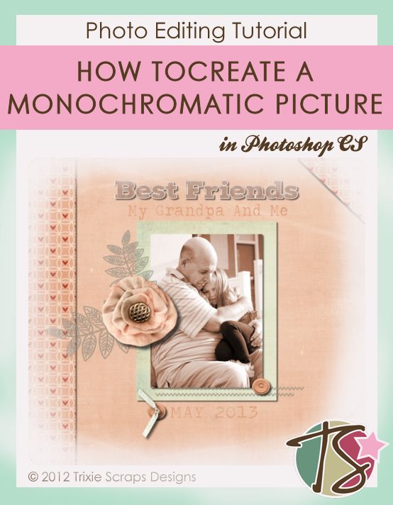
Today’s Masters Monday is a definite mishmash of all sorts of things happening at the same time. But it all comes together in something I am calling Creating A Monochromatic Layout and Photo.
Let’s Talk About It
So I was thinking about what to do for todays post at the same time as listening to music. The music program I use shows album covers for some songs and there was an album cover that came up that gave me a layout as well as a jumping off point for today’s post. The album is Toby Keith’s Greatest Hits: Volume 1, for those of you that need a reference.
This album cover is a very monochromatic cover with shades of brown and even a sepia picture. The words on the album cover are also in browns. Monchromatic things have always been difficult for me to enjoy. I feel like I need more color in my life, but looking at this album cover I realized just how much could be said using a simple layout with a simple color scheme.
The Layout
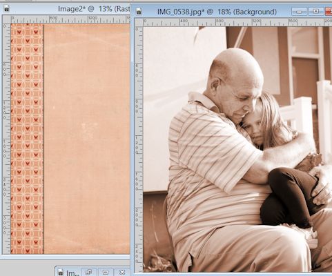
I’ll give you a look at my completed layout and then I’ll walk you through how I changed my photo from being colorful to a pinkish color. I chose the particular photo I did because it describes my daughters relationship with her late grandpa. He was her most favorite person in the whole world. From a very young age she didn’t like very many people, including extended family members – no matter how often we saw them.
But there was something special about Grandpa from day one. She never had any issues going to him and loved to be around him. Since his death, she’s the only kid of mine who has sadly told me she wanted to die just so she could see Grandpa again.
So a photo that tells a story without needing to add a whole lot of explanation works best for this layout.
Color Your Photo To Make It Monochromatic
So how do you change your photo?
In the program I used, it really was super simple. A few clicks of the mouse and a bit of playing around with numbers and you’re done.
First, select your photo.
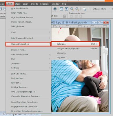
Then go to ADJUST in your toolbar. From the drop-down select HUE AND SATURATION and then COLORIZE.
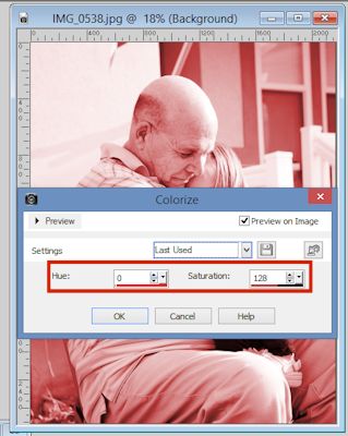
You will see a window that looks like this:
(Make sure you click on PREVIEW ON IMAGE so that you can see when you get the right color. It’ll make the process easier in the long run.)
This is where you will change the color. The HUE changes the color and SATURATION changes the tone of the color. Play around with the numbers to get what you need.
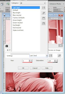
If you are working with more popular colors, you may be able to use one of the presets.
If you’re working with odd colors like I was, pull up your image next to the color window and play around until you get one that close to what you’re working with.
Give It A Go
I’d love to see lots of monochromatic layouts in our gallery. So get them uploaded. Remember, you can win a prize just for uploading a layout in the gallery.
