Welcome back to another Fonts We Love Friday!
If you’re new, this is a post we do monthly where we share some of our favorite fonts with you. It’s a great way to build up your font collection and we here at the Trixie Scraps blog are font hoarders, so there’s never a shortage of ideas.
A Copasetic Font
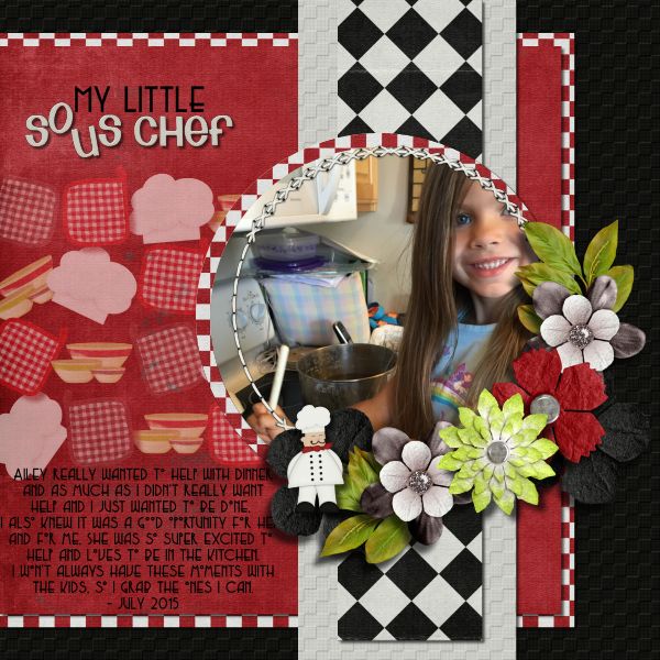
The font I needed for my layout today had to be one that could be found on a menu at a restaurant or one that you could easily associate with food. I didn’t have to look far, when I remembered a font I had used for a previous layout and I knew it would work. The font is called Copasetic and while it’s not spelled the way it maybe should be, it’s a great font all the same.
I absolutely love this font and the fact that it can be so versatile. I can see this font being used in any sort of romantic type page, a costume party/Halloween costume for a couple different time periods and of course, like I did – used for food/restaurant related pages.
My Copasetic Layout
When I originally started my layout, I was going to use a totally different picture and it would’ve been a totally different font I shared, but when I came across the kit Master Chef – I knew I had to use it. It’s one of Trixie’s kits I have never used before, so I was excited. I was even more excited that I didn’t have to think too hard to come up with the font.
It’s Okay To Live A Copacetic Life
We’d love to see how you use this font. I’ve given you some great ideas to start with, but what can you come up with? Scrap a page, hang on to it and make sure to upload it when we get our gallery back up and running later this season.


