Hi there, folks! It’s Carrin here with you today. Are you ready for another Triple T Tuesday? This week I’m going to be talking to you a little bit about non-photo layouts. I know it took me quite awhile before I got up the courage to try one on my own. They always seem so daunting and, well, just plain scary to me for some reason! It wasn’t until I tried one for myself that I realize how fun they can be. Let me walk you through how I built my recent page about my family’s move to our new home, using the Get A Move On collab by Trixie and some of other Scrap Matter designers.
And this is how I got there…
1. I always start with my journaling. Most of the time, that is the hardest part for me to get just right, so instead of agonizing over it I open up my word processing software and write it all out first. You can always edit once you put it on the page to make it fit nicely on the page.
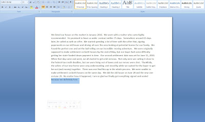
2. It just so happens that I came up with my title as I was writing. I knew I wanted to draw it out from part of my journaling and make it the most important part of the page, so that’s where I started when I opened up Photoshop. This just gave me a better idea of where I wanted to place everything else.
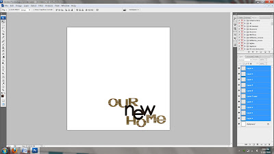
3. Next, I picked out my background papers and copy-and-pasted my journaling onto the page. At this point, I didn’t like the way I had placed my title, so I fiddled with that some, too.
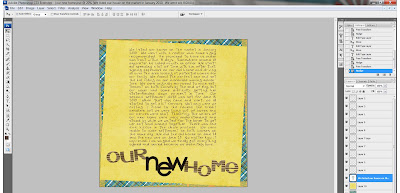
4. Time for some elements! Don’t be afraid to move things around, resize and/or delete things that you don’t think look right. Oh, and don’t forget to save your page as you go along so that you aren’t kicking yourself along the way!
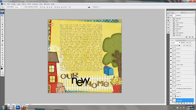
5. Lastly, rock out your page with some super shadows and marvel in your photo-free creativity!
Here’s some more inspiration I found while trolling around in Trixie’s gallery at Scrap Matters.
This one is by Bree using My Summer Garden. You can see how she emphasized the title and created some beautiful layering with the elements.
Kendall also used My Summer Garden for her non-photo page. Don’t you love how she emphasized the journaling by enclosing it in the frame?
Here’s one by Christina aka WimpyChompers. She used the Work It collab by Trixie and The Golden Girls. She grouped all the elements around the journaling in the center of the page to draw your eye in.

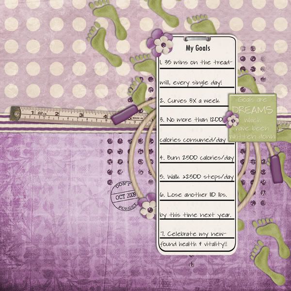
So there you have it…a non-photo page isn’t so scary after all! I’d love it if you would share your stories with us! Just make sure you come back here and link us up to your creation so we can give it all the oohs and ahhs it deserves!!!


