Hey there, today I’m going to give you a blended photo challenge. I love how blended photos look on a layout, but to be honest, I sometimes struggle to make them look right. So this was as much a challenge for me as it is for you! I will also tell you I had a little help and I will explain that later in the post.
Blended Photo Challenge
This week, my Challenge Thursday instructions are brief – all you have to do is include a blended photo on your layout. Now that seems simple enough right? You can also include other photos if you so choose.
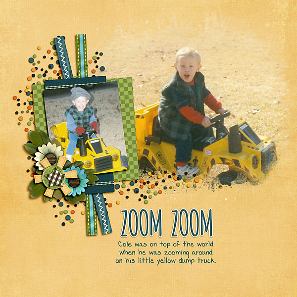
My layout is of my nephew when he was much younger. I used a blended photo and a regular photo. I think the hardest part for me when using a blended photo technique is getting a good shape. If you look at my layout below, I did two things to help that problem. First I used a photo mask from Trixie’s newest kit called Lucky Boy. And secondly, I used a background paper that blended with the photo very well. This is a great tip to use when you want your photo to look like it naturally blends into the page. Using a photo mask and picking a paper that goes well with your photo are two ways to make blended photos pages super easy.
I love the colors of the new kit Lucky Boy, because it is works great for boys, but also can be used for so much more. Just look at all the great colors and elements included in it.
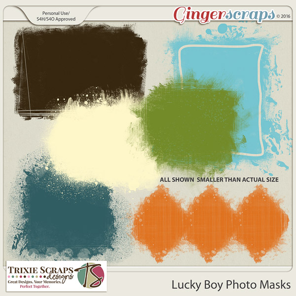
And as a companion product Trixie made these Lucky Boy Photo Masks, and they are awesome. The hardest issue I had using them was deciding which one I wanted to use. I played with all of them, and went back and forth between them because I like them all!
If you choose to make a layout for this challenge using Trixie’s products, be sure to load your layout in the Trixie Scraps Gallery at Ginger Scraps or any other open gallery and link it up in the comments so I can give you some praise. I always love seeing what you create!! I hope you enjoy making your layout as much as I did when I made mine.
